Have you ever printed a design on brown kraft paper and felt sad because the colors looked dull or muddy? Maybe your logo faded into the background. Maybe your text was hard to read. Many designers have problems like brown and black mixing together. Sometimes yellow shades do not stand out. A matte finish can make colors look even softer. You might see that white parts never stand out because you cannot use white ink right on the paper. With CMYK on brown paper, these problems are even easier to see. At BN PACK, we see these problems a lot. We know how important the right design and production steps are. Using white ink underprinting can help your kraft paper bags look their best.
Why Colors Look Dull with CMYK on Brown Paper
Kraft Paper’s Natural Tint
You might notice that colors look different when you print on brown kraft paper. The natural brown tint changes how colors appear. Here’s what happens:
Colors often look duller or more muted than on white paper.
Light colors, like yellow or pale blue, let the brown show through. This makes them less vibrant.
Cooler and brighter colors stand out better, but pastels and warm shades can blend into the background.
The thickness and weight of kraft paper also affect how rich your colors look.
If you want your colors to pop, you need to think about the base color of the paper. Some printers use a white ink base to help colors look brighter and more accurate.
Ink Absorption and Color Shift
Brown kraft paper absorbs ink quickly. This can cause problems with cmyk printing. The ink seeps into the paper, which makes colors lose their vibrance. You might see that your design looks softer or faded. Studies show that the type of pulp and the thickness of the paper change how much ink gets absorbed. If the paper is very absorbent, your colors might not look as sharp or bold.
BN PACK has seen these issues many times. Sometimes, ink absorption causes blotchy prints. You may notice that the surface texture of kraft paper makes the print quality uneven. If you want sharp designs, you need to choose the right paper and printing method.
CMYK Limitations on Brown Substrates
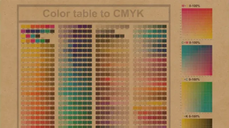
Cmyk on brown paper brings its own set of challenges. The cmyk color space works best on white backgrounds. When you print on brown kraft paper, the brown base affects color reproduction. You might find it hard to match colors exactly. The brown tint can change the way colors mix, making them look muddy or less accurate.
BN PACK often helps customers solve these problems. Sometimes, alignment during mass production is tricky. Custom designs can also increase costs because you need special steps for better color reproduction. If you want vibrant prints, you need to understand how cmyk interacts with brown kraft paper.
Design Strategies for Vibrant CMYK Prints
High-Contrast Color Palettes
You want your design to be easy to see on brown kraft paper. Using high-contrast color palettes helps a lot. When you put dark colors next to light ones, your design stands out. Try using deep blues, reds, or greens with bold black or white parts. Stay away from colors that blend into the brown paper. Strong contrast makes your logo or message easier to read. If you use the cmyk color model, pick colors that are very different from the paper’s natural tint. This way, your design gets noticed and the colors stay true.
Tip: Print a small sample to test your palette. You can check which colors look best on the real kraft paper.
Boosting Color Saturation
You can make your colors brighter by boosting saturation. The cmyk color model sometimes needs extra help on brown paper. Here are some ways to make colors pop:
Change color builds for uncoated paper to make colors stronger. Your colors will look richer and deeper.
Use Pantone inks if you want colors to match better. Pantone inks often look brighter than regular cmyk.
Always ask for proofs on the same paper you will use. This lets you see how your colors will look before printing everything.
When you boost saturation, your colors look more lively. Your design will catch people’s eyes and not fade into the background.
Avoiding Light and Pastel Colors
Light and pastel colors do not show up well on brown kraft paper. The brown paper mixes with these colors and makes them look dull. If you use cmyk, do not pick pale yellows, soft pinks, or light blues. These colors lose their strength and are hard to see. Instead, choose bold, bright colors. Your design will look clearer and the colors will stand out. If you really need to use light colors, try adding a white ink underlay. This helps the colors pop and keeps them looking good.
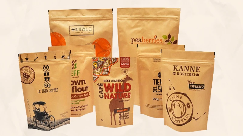
Minimalist Designs with Kraft Paper Bag Texture
Minimalist designs look great on kraft paper bags. The paper’s natural texture and color add style to simple graphics. You do not need lots of colors or busy patterns. Clean lines and basic shapes look modern and fresh. Minimalism also fits the eco-friendly feel of kraft paper. Your design looks honest and good for the planet. When you use the cmyk color model, stick to a few strong colors. Let the paper’s texture do the rest. You get bright colors and a special look.
BN PACK gives you many ways to make your kraft paper bags look great with cmyk prints. Here is a quick look at your choices:
Customization Feature | Description |
|---|---|
Bag Dimensions | You can pick sizes from 250g to 5kg. |
Resealable Zippers | You can add zippers to make bags easy to open and close. |
Tear-Notches | Tear-notches make it easy for people to open the bag. |
Finishes | You can choose matte or shiny finishes and even holographic effects. |
Interactive Branding | Add QR codes to help customers connect with your brand. |
Eco-Friendly Materials | Made from FSC-certified Kraft paper with liners that break down, which helps cmyk printing. |
Strength | The bottoms are strong and can hold up to 2kg. Coatings keep oil stains away. |
You can mix and match these features to get the look you want. BN PACK helps you get bright colors and strong prints, even when using cmyk on brown paper.
White Ink Underprinting for Color Accuracy

What Is White Ink Underlay?
White ink underlay is a special printing trick that helps your designs look bright and clear on brown kraft paper. You might wonder how it works. Printers lay down a layer of white ink first, right under the parts of your design that need to stand out. This white layer acts like a blank canvas. It blocks the brown color of the paper from mixing with your colors.
Here’s what happens during the process:
The printer puts down white ink in the spots where you want your colors to pop.
Then, the printer adds your cmyk colors on top of the white ink.
The white ink keeps your colors from looking faded or washed out.
This technique is very important for kraft paper bags. The brown paper can make colors look dull. White ink underlay stops that from happening. You get designs that are sharp and easy to see.
Tip: If you want your logo or text to be bright, ask your printer about using a white ink underlay.
How White Ink Enhances CMYK Colors
You want your kraft paper bags to show off vibrant colors. White ink underprinting makes this possible. When you use the cmyk color model, the colors need a solid base to look their best. Brown kraft paper is dark and can change how your colors look. White ink solves this problem.
Here’s how white ink helps:
It creates a strong base for your cmyk colors.
Your colors look brighter and more accurate.
You get better color reproduction, so your design matches what you see on your screen.
White ink helps with color fidelity, making sure your brand colors stay true.
Without white ink, your colors can look muddy or faded. With white ink, you get color vibrancy and sharp details. This is why many brands choose white ink underprinting for their kraft paper bags.
When to Use White Ink with Kraft Paper Bags
You should use white ink underprinting in certain situations. Not every design needs it, but many do. Here are some times when white ink is a smart choice:
Your design has light colors, like yellow, pink, or light blue.
You want white parts in your design to look bright, not brown.
Your logo or artwork needs to match your brand’s colors exactly.
You want to improve color reproduction for detailed graphics.
Kraft paper has a rough texture and a dark color. White ink helps your design stand out. Some printers, like BN PACK, use special finishes to help the ink stick better. They also check your design file to see where white ink will work best. If you want the best results, talk to your printer about adding a white ink underlay.
Note: Some printers may charge extra for white ink because it takes more time and skill. It’s worth it if you want your kraft paper bags to look amazing.
Comparison: With vs. Without White Ink
Let’s see what happens when you print with and without white ink underprinting. If you print cmyk on brown paper without white ink, your colors can look muted. Light colors, like orange and yellow, almost disappear. Even bright colors lose their punch. The brown paper changes the way your design looks.
When you use white ink underprinting, everything changes. Your colors look bold and lively. Light shades and pastels stand out. You get better color reproduction and your design matches your brand’s style. White ink makes a big difference in color vibrancy.
Here’s a quick comparison:
Feature | Without White Ink | With White Ink Underprinting |
|---|---|---|
Light Colors | Muted, hard to see | Bright and clear |
Brand Color Matching | Difficult | Accurate |
Poor | Excellent | |
Overall Look | Dull | Vibrant and eye-catching |
BN PACK uses white ink underprinting to help you get the best results. You can trust your kraft paper bags to look sharp, colorful, and professional.
Production Tips for CMYK on Brown Paper
Set Up Artwork in CMYK Mode
If you want bright colors and clear details, start your design in the cmyk color model. This stops colors from changing when you print. Use good quality images in cmyk mode. Make sure your images are at least 150 DPI for big prints. Check your blacks because rich black looks darker than normal black. Flatten all effects and transparencies before you send your file. Vector graphics keep your art sharp at any size. Outline or embed all fonts so nothing is missing when printing. These steps help your colors look their best on brown kraft paper.
Communicate with Your Printer
It is important to talk to your printer. Tell them what colors you want and what you need for your project. Use a Pantone book to pick colors that look good on kraft paper. Remember, cmyk on brown paper can make colors look darker or warmer than you think. Ask for samples or drawdowns before you say yes to the final order. Here is a table to help you:
Key Considerations | Description |
|---|---|
Physical Color Matching Tools | Use Pantone books for accurate color selection. |
Impact of Kraft Substrate | Kraft paper changes how colors look—often darker and browner. |
Requesting Samples | Always ask for samples to see real color reproduction on kraft paper. |
Request Proofs and Color Simulations
Always ask for proofs and color simulations before you print everything. Press proofs show you how your design will look on brown kraft paper. They help you check if your colors are bright and clear. You can find problems early and fix them if you need to.
Press proofs are very important for checking the final print, especially with brown kraft paper. They give you a clear preview of your finished product on the real paper. This helps make sure your printing project turns out right.
BN PACK gives you print simulations so you can see your design on the real material. This step helps you get the colors you want.
Choose the Right Paper Finish
The finish of your kraft paper bag changes how cmyk colors look. Kraft paper soaks up ink fast, which can make colors look dull or warmer. Uncoated kraft paper is rough and soaks up more ink, so cmyk colors may not look as bright. White kraft paper gives you better color results, especially with UV printing. If you want bright colors, ask your printer which finish is best for your project.
BN PACK’s team can help you choose the right paper and finish for your kraft paper bags. They help you from the start of your design to the end of printing.
Real-World Examples and Best Practices
Recommended vs. Not Recommended Colors
You want your kraft paper bags to look sharp and professional. Picking the right colors makes a big difference. Some colors work better than others when you use cmyk printing on brown kraft paper. Here’s what you should know:
Black stands out and looks bold.
White pops when you use a white ink underlay.
Deep reds and blues catch the eye.
Light colors, like pale yellow or soft pink, often look dull. They blend into the brown paper and lose their impact.
If you stick with strong colors, your design will stay clear. You get better color reproduction and your message stays visible.
Before-and-After: White Ink Impact
Let’s look at what happens when you print with and without white ink underlay. Imagine you have a logo with yellow and blue. If you print straight cmyk on brown kraft paper, the yellow fades and the blue looks muted. Your design loses its punch.
Now, add a white ink underlay. The yellow turns bright and the blue looks crisp. You see true color reproduction. Your logo matches your brand colors and grabs attention.
Print Method | Color Reproduction | Vibrancy | Brand Match |
|---|---|---|---|
CMYK Only | Low | Dull | Poor |
CMYK + White Ink | High | Bright | Excellent |
You can see the difference right away. White ink underlay helps your cmyk colors shine and keeps your design looking fresh.
Successful BN PACK Kraft Paper Bag Designs
BN PACK has helped many brands create kraft paper bags that stand out. You can see the results in their projects. For example, a coffee shop wanted bold black text and a bright logo. BN PACK used cmyk printing with a white ink base. The colors looked vibrant and the logo matched the brand perfectly.
Another client needed strong color reproduction for a food product. BN PACK suggested deep green and red for the design. The cmyk colors stayed true, and the bags looked professional on store shelves.
Tip: If you want your kraft paper bags to look their best, ask BN PACK about cmyk printing with white ink underlay. You get reliable color reproduction and a design that pops.
Quick Checklist for Vibrant Kraft Paper Printing
Steps to Avoid Dull Colors
You want your kraft paper bags to look bright and eye-catching. A simple checklist can help you get the best results every time you print. Here’s what you should do:
Step | What You Do | Why It Matters |
|---|---|---|
Choose file format | Use PDF, AI, or TIFF | Keeps colors sharp |
Set color profile | Download and use the right profile | Matches colors to substrate |
Use spot colors | Pick Pantone or other spot colors | Ensures color matching |
Convert to CMYK | Change files from RGB to CMYK | Avoids dull colors |
Get a proof | Ask for print proof or press proof | Checks desired colors |
Tip: Always ask your printer for a proof on the actual kraft paper. This way, you can see how your colors will look before you print a large batch.
Mistakes can happen, but you can avoid them if you know what to watch out for. Here are some common mistakes and how to steer clear of them:
Common Mistakes to Avoid | Explanation |
|---|---|
Relying solely on software values for color matching | Always compare your printed colors to a physical Pantone book. This helps you see the real color, not just what’s on your screen. |
Comparing different batches of printed materials | Color can drift between batches. Use a Pantone guidebook for each new print run to keep colors consistent. |
Not considering the substrate’s effect on color | Brown kraft paper absorbs ink differently. Sometimes, you need a white underlayer to make colors pop. |
📝 Remember: Kraft paper changes how colors look. Always plan for this in your design and printing steps.
If you follow this checklist, you’ll avoid dull colors and get kraft paper bags that stand out. Bright, bold prints are possible with the right steps!
You can get vibrant, accurate colors on brown kraft paper if you use smart design and printing techniques. Check out this table to see what works best:
Technique | Description |
|---|---|
White Ink Undercoating | Blocks the brown paper, so your colors stay bright. |
Offset Printing | Gives you sharp details, especially with a white base. |
Dark High-Contrast Colors | Black and navy blue pop without extra steps. |
Printing with white ink underlay keeps your colors true and stops them from fading into the paper. BN PACK helps you customize kraft paper bags for bold results. Want to see your design shine? Ask BN PACK for a free print simulation today! 🎨