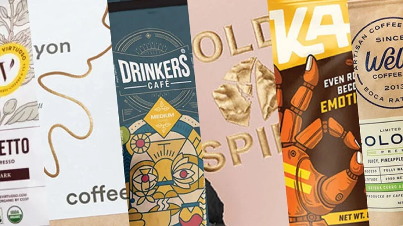
When you make your coffee packaging logo, put it on the front center or top of the bag. You can also use the back or sides. This depends on the bag style. Putting your logo here helps people see your brand quickly. Studies show logos in clear spots get more attention. This helps people remember your brand and makes your brand look stronger.
Research Objective | Description |
|---|---|
Measure visual impact | Checked how different designs changed how easy it was to see and remember the logo. |
Evaluate visibility properties | Looked at how well each design stood out on shelves next to other brands. |
Assess imagery conveyed | Studied how each design made people feel about the brand and how much they liked it. |
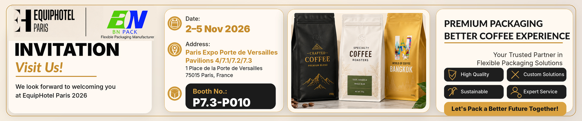
BN PACK lets you change your coffee packaging so your logo is easy to see every time.
Coffee Packaging Logo Placement
Front Center Position
When you want your coffee to stand out, put your coffee packaging logo right in the front center. This spot grabs attention fast. Most people look at the middle of a bag first. If your logo sits there, shoppers see your brand before anything else. You can make your logo bigger or use bright colors to help it pop. This makes your bag easy to spot, even on a busy shelf.
Here’s a quick look at why the front center works so well:
Principle | Explanation |
|---|---|
Size and scale | A bigger logo in the center draws eyes right away. |
Color and contrast | Bright or bold colors make your logo stand out from the rest of the bag. |
Leveraging viewing patterns | People’s eyes go to the center first, so your logo gets noticed immediately. |
If you want your brand to be remembered, the front center is the best place for your coffee packaging logo. This spot helps you build a strong brand image and makes your coffee easy to find.
Top Section Visibility
You can also place your logo at the top of the bag. This works well if your bag sits upright on a shelf. When shoppers look down at the bags, they see the top first. A logo at the top can catch their eye before they even pick up the bag. This spot is great for smaller logos or for brands that want a clean, modern look.
Try using a logo at the top if you want to keep the front of your bag simple. You can pair it with other design elements, like a window or a bold label. This way, your logo still gets noticed, but your bag does not look crowded.
Tip: If you use a zipper or a resealable strip, make sure your logo sits above or below it. This keeps your design neat and easy to read.
Back and Side Panels
Sometimes, you need more space for your story. The back or side panels give you extra room. You can put a smaller coffee packaging logo here, along with details about your brand or your coffee’s origin. This is a good spot for extra information, like brewing tips or social media icons.
The back and sides do not get as much attention as the front, but they still matter. When someone picks up your bag, they often turn it around. A logo on the back or side helps remind them of your brand while they read more about your coffee.
You can use these panels to show off your logo in a new way. Try a different color or a special finish, like a matte or glossy look. This adds interest and makes your packaging feel special.
Brand Impact and Shelf Appeal
Enhancing Recognition
You want your coffee to stand out. The way you place your coffee packaging logo can make a big difference. When you put your logo in the right spot, people notice your brand faster. Packaging acts like a silent salesman. It tells shoppers about your coffee before they even taste it. If your logo sits front and center, it grabs attention and shows off your brand’s personality.
Did you know? The front panel of your bag is the best place for your logo. It helps shoppers remember your brand and makes your coffee look more professional.
Here are some reasons why smart logo placement matters:
Packaging shows quality and attracts attention.
Your bag can tell your brand’s story in just a few seconds.
A strong logo spot helps your coffee stand out on busy shelves.
You can also use color to boost recognition. Many top coffee brands stick to two or three main colors. This makes their products easy to spot, whether in a store or online.
Strategy | Benefit |
|---|---|
Limited color palette | Builds brand consistency |
Front panel logo | Increases shelf impact |
Unique design features | Helps your coffee get noticed |
Changing your packaging can even affect sales and where your coffee sits in stores. Companies often update their bags to boost revenue or save money. When you focus on your logo and design, you help your brand grow.
BN PACK Coffee Bag Examples
BN PACK gives you lots of ways to show off your logo. You can pick stand-up pouches, flat bottom bags, or side gusset bags. Each style lets you place your logo where it gets the most attention. For example, a stand-up pouch puts your logo right at eye level. Flat bottom bags give you a wide front panel for a bold design. Side gusset bags offer extra space for your logo and story.
You can choose finishes like matte or glossy to make your logo pop. BN PACK also lets you use eco-friendly materials, so your packaging looks good and feels good. Some bags have clear windows or resealable zippers. These features help your coffee stay fresh and make your brand look modern.
Tip: Try different logo sizes and placements. Test what works best for your brand. BN PACK’s custom options make it easy to create packaging that fits your style.
If you want your coffee to get noticed, start with a smart logo placement. BN PACK helps you build packaging that works for your product and your brand.
Packaging Types for Coffee Bags
Stand-Up Pouches
Stand-up pouches are a favorite for many coffee brands. You see these bags standing tall on store shelves, making them easy to spot. The wide front gives you a perfect spot for your coffee packaging logo. You can make your logo big and bold, so shoppers notice it right away. These pouches also work well with bright colors and creative designs. The upright shape means your logo always faces forward, even when the shelf is crowded. Stand-up pouches are lightweight and cost-effective, so you get great value for your brand.
Tip: Try adding a resealable zipper or a clear window. These features keep your coffee fresh and let customers peek inside.
Flat Bottom Bags
Flat bottom bags look modern and professional. They stand up straight and have a flat base, which makes them stable and easy to stack. You get a large front panel for your logo and product details. BN PACK lets you customize these bags in many ways. You can pick the size, finish, and even add special touches like embossing or spot UV coatings. Want a glossy look? Or maybe a matte finish? You choose what fits your brand best.
Customization Option | Description |
|---|---|
Full Custom Printing | Add your logo, artwork, and product info |
Finish Options | Matte, glossy, or metallic for extra appeal |
Special Coatings | Embossing, debossing, or spot UV available |
Flat bottom bags also come in eco-friendly materials like kraft paper or PLA. These choices help your brand look good and do good for the planet.
Side Gusset Bags
Side gusset bags give you a classic coffee shop feel. They have extra panels on the sides, so you get more space for your story or logo. These bags fold flat, which makes shipping easy and saves space. You can print your logo on the front, back, or even the side panels. Many traditional coffee brands love this style because it looks timeless.
You can pick from materials like rice paper, kraft paper, or LDPE. Each one changes how your logo looks and feels. For example, kraft paper gives a rustic vibe, while LDPE lets your colors pop. BN PACK also uses sustainable inks, so your logo matches your eco-friendly message.
Note: Side gusset bags need shelf support to stand up, but they still show off your brand when displayed flat or upright.
No matter which bag you choose, BN PACK helps you create packaging that fits your brand and makes your coffee stand out.
Logo Integration with Packaging Elements
When you design your coffee bag, you want everything to look clear and organized. Your coffee packaging logo should stand out, but you also need to include other important details. Let’s look at how you can balance your logo with labels, dates, and contact info.
Labeling and Certifications
You need to show things like barcodes, certifications, and product names on your coffee bag. These details help your bag meet rules and build trust with customers. The trick is to keep your design clean and easy to read.
Here’s a simple way to organize your bag:
Design Element | Importance |
|---|---|
Logo Placement | Make your logo easy to see. It’s the main part of your brand. |
Text Hierarchy | Put the product name and weight where people look first. |
Barcode and Certifications | Place these in a corner or on the back so they don’t crowd your logo. |
You can use BN PACK’s custom options to move these elements around. Try different layouts until your bag looks balanced.
Roast Date and Batch Info
People want to know when their coffee was roasted. Freshness matters. You should add the roast date and batch number in a spot that’s easy to find but doesn’t take away from your logo. Many brands print this info near the bottom or on the back.
BN PACK lets you pick where to put this info. You can use special finishes like matte or glossy to make your logo pop, while still keeping dates and numbers clear. Features like one-way degassing valves and tear-notches also help you add info without making the bag look busy.
Social Media and Contact Icons
Customers like to connect with brands online. Adding social media icons or a website helps people find you. Keep these icons small and place them on the back or side of the bag. This way, your logo stays the star.
BN PACK’s design flexibility makes it easy to fit everything you need. You can choose from:
Matte or gloss finishes for style
Embossing for a textured logo
Eco-friendly materials for a green message
Compostable zippers and valves for extra features
With the right layout, your bag will look professional and tell your brand’s story at a glance.
Design Tips for Coffee Packaging Logo
Logo Size and Proportion
You want your logo to stand out, not get lost in the crowd. The size of your logo matters a lot. If you make it too small, people might miss it. If you make it too big, it can overpower other details. A well-sized logo helps shoppers spot your brand fast. It also shows off your brand’s personality. Coffee packaging works as a marketing tool, so you need your logo to grab attention. When you balance the size and proportion, your bag looks professional and feels inviting.
Coffee packaging helps you catch the eye of shoppers.
Smart design can set your brand apart from others.
The look and size of your logo shape how people see your brand.
Tip: Try printing a sample bag and see how your logo looks from a distance. If you can spot it easily, you’re on the right track.
Color Contrast
Colors make your logo pop. High contrast colors like black and white or bold shades help everyone see your logo, even people with vision problems. You want your color scheme to stay the same on every bag. This keeps your brand easy to recognize. Always check that your text and background colors don’t blend together. If they do, your logo might be hard to read.
Use strong contrast between your logo and the background.
Test different color combos to make sure everyone can read your logo.
Add outlines or textured patterns if your colors are similar.
Note: Consistent colors build trust and make your coffee stand out on the shelf.
Readability and Testing
You need to know if your logo works in real stores. Polling and A/B testing help you find out what shoppers like. Show your designs to people and ask which one they notice first. You can compare two bags side by side or ask people to rank a few options. Their feedback tells you if your logo is clear and easy to read. This helps you make smart changes before you print a big batch.
Testing Method | What It Does |
|---|---|
Polling | Gets opinions from shoppers |
A/B Testing | Compares two designs |
Ranking | Finds the most popular look |
Try testing your coffee packaging logo with friends or customers. Their advice can help you create a bag that stands out.
You want your coffee brand to shine. Place your logo where people see it first. Add your company name, website, and contact info to build trust. Always check that your bag meets local rules. Try top or bottom logo spots for the best results. BN PACK gives you custom coffee bags that make your logo stand out. Take a look at your packaging and see how you can boost your brand’s visibility today!