Many people think 300 DPI always gives you sharp printing. You may notice small text looks blurry or hard to read, even at this standard quality. The problem comes from the limits of raster images and how printing works. In the vector vs. raster debate, vector graphics keep text clear at any size. A table below shows how factors like image resolution, dot gain, and substrate affect quality:
Factor | Details |
|---|---|
Resolution (DPI) | Higher DPI helps small text, but 300 DPI often misses fine detail. |
Dot Gain and Ink Spread | Ink can blur edges, lowering quality for small text. |
Substrate Properties | Paper type changes how sharp your text looks. |
Small Text at 300 DPI
Rasterization and Pixel Limits
When you use raster images for printing, you work with a grid of tiny squares called pixels. Each pixel in a bitmap holds color information, but it cannot show more detail than its size allows. At 300 dpi, raster images often seem sharp for large graphics. However, small nutrition text can push the limits of what a bitmap can display. If you try to print text that is too small, the pixels cannot capture all the fine details. This leads to blurry or broken letters.
You might think 300 dpi is enough for any text, but that is not always true. The minimum font size for clear nutrition labels depends on the color contrast. The table below shows how small you can go before raster images lose legibility:
Font Color | Minimum Font Size |
|---|---|
Dark on Light | 5 pt |
Light on Dark | 7 pt or larger |
If you use a font smaller than these sizes, the bitmap cannot hold enough details. This makes the text hard to read, even if you use high-quality printing.
Loss of Detail in Fine Print
When you print fine text with raster images at 300 dpi, you may notice several problems. The bitmap grid cannot always show the sharp edges and thin lines in small letters. As a result, you see pixelation and blurriness. These visual artifacts lower the quality of your print and make important information hard to read.
If you use a lower resolution than 300 dpi, the problems get worse. The text can look distorted and lose even more details. Sometimes, the print appears soft or fuzzy, which is not acceptable for nutrition labels. You want every letter to stay crisp and clear, but raster images at 300 dpi often fail to deliver that quality. Using vector graphics instead of bitmap images helps you avoid these issues and keeps your text sharp at any size.
Raster Image Resolution Challenges
DPI and Scaling Issues
Some people think 300 dpi always makes things look sharp. But raster images have limits. Raster images use lots of tiny squares called pixels. You need high resolution for small nutrition text to look clear. If you use less than 300 dpi, you will see blurry or blocky text. This makes small words hard to read and lowers the quality.
If you make raster images bigger, you lose detail. When you stretch a raster image, the pixels get bigger and the text gets fuzzy. This is a bigger problem for small text on packages. You cannot just raise the dpi after making the image. The first resolution you use sets how good it will look.
Here is a table that lists common problems with raster images for small text on packages:
Challenge | Description |
|---|---|
300 DPI requirement | You need 300 DPI or more to stop pixelation and keep small text clear. |
Low-resolution issues | Images under 300 DPI can look blurry or blocky, making small text hard to read. |
Distortion from resizing | Raster images can get messed up when you change their size, so small text can look unclear. |
You might use raster images for websites, but for printing, you must check dpi and resolution before you print.
Anti-Aliasing and Misregistration
When you print small raster text, you might see rough edges on the letters. Anti-aliasing helps by smoothing these edges. It mixes colors at the edge of each letter. This makes the text look softer and easier to read. Anti-aliasing can help your eyes and make images look better, especially for small text. You should always look at anti-aliasing in your raster images before you print.
Misregistration is another printing problem. If colors do not line up, you might see gaps or colored edges around small text. This can make the words hard to read. Printers use tricks like trapping to fix this, but if it is not done right, the text can get even blurrier. Bitmap images are very sensitive to these problems.
You might use raster images for websites, but for packages, you must care about image quality and resolution. Always check your raster images at the real print size so you do not get bad surprises.
Raster images depend on resolution, so using the wrong dpi or size can ruin the quality.
Anti-aliasing helps you read small text, but you must use it the right way.
Raster images are common for websites, but printing needs better quality.
Tip: Always make your raster images at the right size and dpi for printing. Do not try to fix problems by resizing later.
Vector vs. Raster for Nutrition Labels
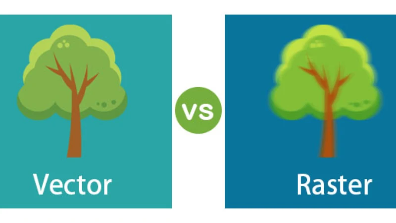
Vector Clarity at Any Size
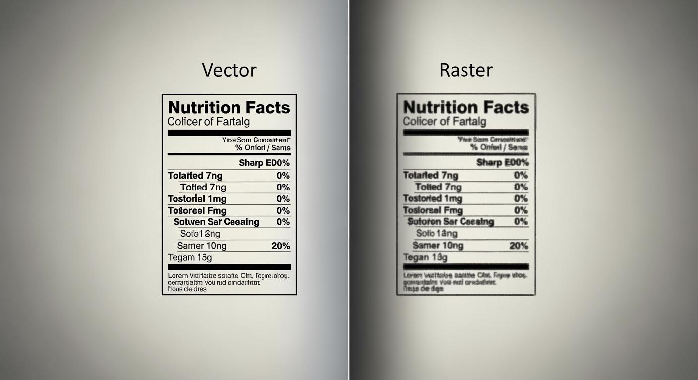
When you look at vector and raster images for nutrition labels, you notice a big difference. Vector graphics use math to make shapes and lines. You can make vector images bigger or smaller, and the edges of small text stay sharp. Raster images use pixels. If you make them bigger or print small text, the edges can look fuzzy or broken. Even with 300 DPI, raster images do not look as crisp as vector graphics for tiny letters.
You should think about how packaging design works. Using vector images for nutrition labels gives you clear and easy-to-read text. Vector graphics do not lose quality when you change their size. Raster images can get pixelated and hard to read, especially for small text on packages. This matters because you want people to read nutrition facts easily.
Printing technology is important too. Offset, digital, and flexo printing all work better with vector graphics for text. Vector images keep lines and letters sharp. Raster graphics can look fuzzy. You should use vector images for packaging design when you need detailed pictures and small text. This helps you follow the rules for nutrition label legibility in the US and EU. Both places need clear and readable text, with minimum font sizes and special formats.
Here is a table that compares vector and raster for nutrition labels:
Feature | Vector Images | Raster Images |
|---|---|---|
Clarity for Small Text | Always sharp and clear | Can look fuzzy or pixelated |
Scalability | Unlimited, no loss of quality | Loses quality when scaled |
Printing Results | Crisp edges, easy to read | Edges can blur, hard to read |
Packaging Design Use | Best for nutrition labels | Risky for small text |
Tip: Always check your nutrition label at the real print size. Use vector images for small text so everything stays readable.
Outlined Fonts and Packaging
Outlined fonts are very important in packaging design. When you outline fonts in vector images, you turn text into shapes. This means the letters will not change or break if you open the file on another computer. Outlined fonts keep your nutrition label safe from font mistakes and missing files. You should always outline fonts before you send your packaging design to print.
If you do not outline fonts for small text, you can have problems:
Important information is hard to read
People might not understand the label
You could break the rules
Your brand could look bad
You want your packaging design to follow the law. The US and EU both need clear nutrition labels with minimum font sizes. Outlined fonts in vector images help you follow these rules. You also avoid problems with missing fonts or broken text.
Vector images also help with file size and print speed. Here is a table that shows the differences:
Feature | Vector Files | Raster Files |
|---|---|---|
File Size | Smaller and more efficient | Tend to be larger in file size |
Resolution & Scalability | Remain crisp and clear at any size | Lose quality when scaled |
Image Quality | Ideal for crisp and clean graphics | Ideal for photo-realistic images |
You should use vector images for packaging design when you need small text, detailed pictures, and clear nutrition facts. Raster images are better for photo-realistic images, but not for text or detailed artwork. Choosing vector or raster is a big decision in packaging design. Vector images are best for nutrition labels because they keep text sharp, follow the rules, and make your packaging look professional.
Note: Always outline your fonts and use vector images for nutrition labels. This keeps your packaging design safe, clear, and ready for printing.
Best Practices for Designers
When to Use Vector Text
You should always use vector for small text on packaging. Vector keeps every letter sharp, even when you change the size or print on different materials. Raster can make text look blurry or blocky, especially if you scale the image or use low resolution. Printers say vector works best for logos, engravings, and signage because it stays clear and sharp. Raster is better for photos, but not for small text or graphics that need crisp edges.
Here are steps to follow for high-quality prints:
Ask your printer about file format requirements. Most printers want vector files for packaging.
Check your colors. Make sure colors look good on your chosen print media.
Get print-ready files from your designer. These files should meet all printing specifications.
Pick the right packaging material. Some materials work better with vector graphics.
Request a sample box. This lets you see the final product and make changes before mass production.
Vector software tools help you create nutrition labels that meet FDA rules. Packify, Food Label Maker, and Lovart let you export labels in formats like PDF and SVG. These tools make sure your design stays sharp and meets printing specifications.
Printers say raster images can look blocky and pixelated when scaled. Vector images always stay sharp and clear, which is important for high-quality prints.
Checking Print Proofs and Font Size
You need to check your print proofs before final production. Test prints help you see if small text is readable and colors are accurate. Always look at the alignment and trim to make sure everything lines up. Ask your team for feedback to spot any problems with readability.
The FDA says nutrition labels must use at least 6 point font size. Using the right font size keeps your packaging legal and easy to read. Outlined fonts in vector files prevent missing letters or broken text. This step protects your design and keeps your packaging professional.
Common mistakes include using low-resolution raster images, not checking for spelling errors, and having messy file layers. Keep your files organized and use vector for all critical information. This helps you avoid problems during printing and keeps your packaging looking its best.
Mistake Type | Description |
|---|---|
Layer and separation organization | Disorganized files can lead to lost elements or dropped colors during the pre-press process. |
Type size, weight, and height all affect how easy it is to read small text. You should always check these features in your print proofs.
Now you can see why 300 dpi raster images are not good for small nutrition text on packages. Vector graphics make text and designs look sharp at any size. Raster files lose detail and do not look as good. Print experts say vector graphics have these strong points:
Characteristic | Description |
|---|---|
Scalability | Vector images can get bigger or smaller and still look great. |
Clean and Precise | Best for sharp text, logos, and icons. |
File Efficiency | Vector files are smaller than big raster images. |
Using vector-based tools for important packaging details helps you in many ways:
You make your brand look the same everywhere and help your marketing.
You help the planet by making less waste when printing.
You keep your brand looking strong and professional.
Pick vector graphics for all small text and important details. This keeps your printing sharp and makes your packaging look great, even when 300 dpi raster images do not work well.