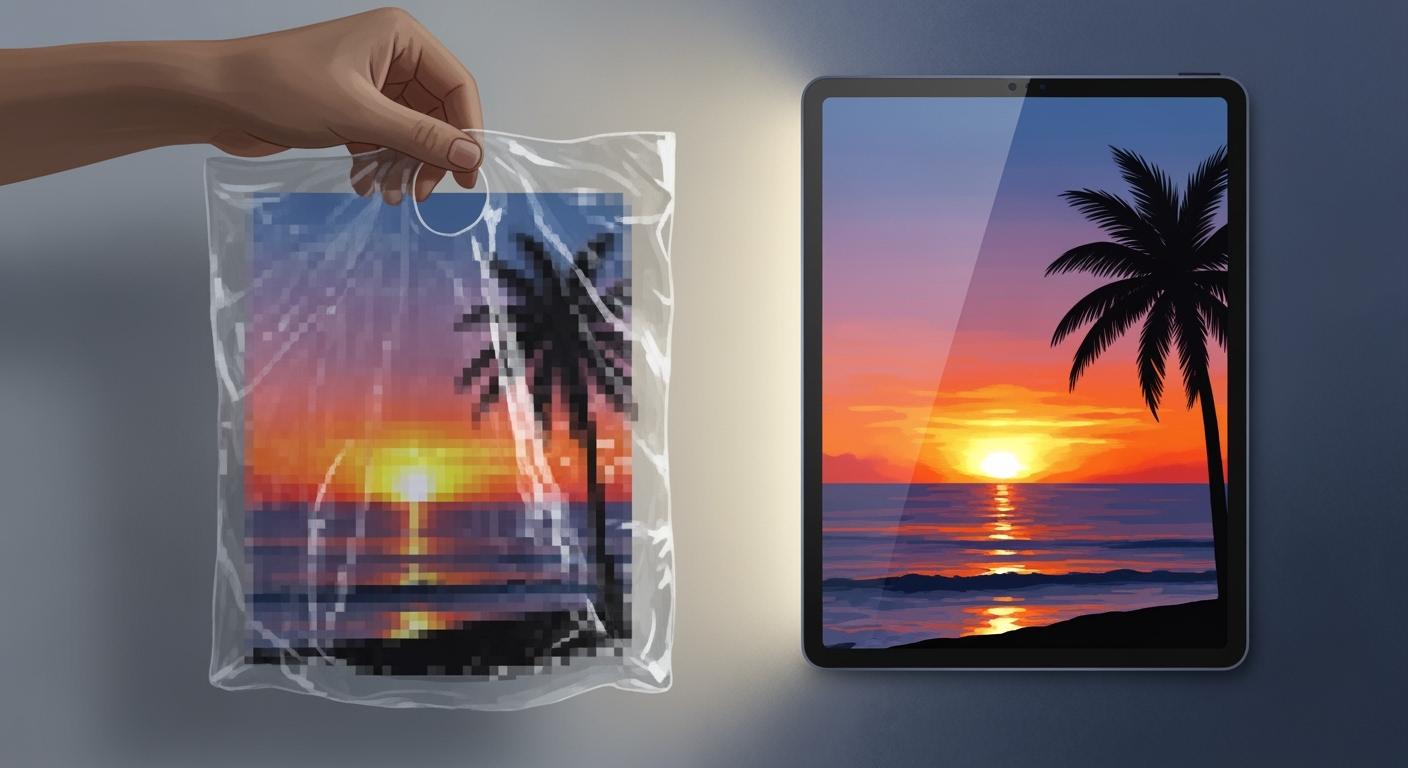
You might see that 72 dpi images look clear on your screen. But if you print 72 dpi images on coffee bags, they do not look good. Your screen shows images with less detail, which is fine for computers. Printing needs much more detail to look nice. For things like coffee bags, you need at least 350dpi for sharp and bright prints. This higher resolution makes sure your printed design looks great and catches attention in stores.
72 DPI Images vs. Print Resolution
Screen Display and 72 DPI
When you look at images on your computer or phone, you see them at 72 dpi. This means the screen shows 72 dots, or pixels, in every inch. Most digital screens use pixels per inch, or ppi, to measure how many tiny squares fit in one inch. Your eyes see these images as clear and sharp because screens do not need a lot of detail. The average screen uses a lower pixel density than what you need for printing.
Digital screens often have a pixel density between 72 and 150 ppi.
Most images for the web use 72 dpi images because they load fast and look good on screens.
The sharpness you see on a screen does not mean the image will look sharp when printed.
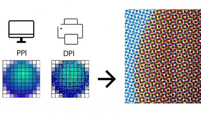
Printing Needs Higher Resolution
Printing works differently from screens. Printers use dots per inch, or dpi, to show how many ink dots fit in one inch. You need a much higher resolution for printing than for screens. If you use 72 dpi images for printing, the result will look blurry or pixelated. For packaging like coffee bags, you should always start with high-resolution artwork.
Most packaging, including BN PACK coffee bags, uses 300 dpi as the standard for sharpness and detail.
At 300 dpi, the ink dots are so small that your eyes cannot see them, making the print look smooth and professional.
Using images with at least 300 dpi ensures your coffee bag design stands out on the shelf.
Here is a quick comparison:
Print Quality Level | DPI Needed | Result on Packaging |
|---|---|---|
Low | 72 dpi | Blurry, pixelated print |
Standard | 150 dpi | Acceptable, but not sharp |
High | 300 dpi | Crisp, professional look |
If you use low-resolution images, you risk blurry logos and dull graphics. Always use high image resolution for your packaging to protect your brand’s image.
RGB vs. CMYK: Physical Differences
You may notice that colors on your screen look brighter than on printed coffee bags. This happens because screens use RGB color, while printers use CMYK. RGB stands for red, green, and blue. CMYK stands for cyan, magenta, yellow, and black. These two systems create colors in different ways.
Aspect | RGB (Additive) | CMYK (Subtractive) |
|---|---|---|
Color Gamut | Wider, more vibrant colors | Narrower, can lead to duller colors |
Usage | Digital displays | Printing |
Color Mixing | Combines light | Combines inks |
Black Ink | No separate black | Uses black ink (K) for depth |
Color Conversion | Can lead to color shifts | Some RGB colors not replicable |
When you prepare artwork for printing, always convert your images from RGB to CMYK. This step helps you avoid color shifts and keeps your coffee bag design looking as close as possible to what you see on your screen.
Tip: Start your design with high image resolution and the correct color mode. This simple step saves time and prevents costly mistakes in the printing process.
BN PACK has seen many brands struggle with print quality because they used 72 dpi images or the wrong color mode. You can avoid these problems by using 300 dpi images and CMYK color for all your packaging artwork. This approach ensures your coffee bags look sharp, vibrant, and professional every time.
Printing Quality on Packaging
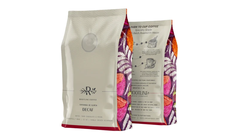
Why Image Quality Matters for Coffee Bags
When you see a coffee bag, you notice the design first. Good image quality makes colors bright and details easy to see. BN PACK coffee bags use special printing to make every logo and pattern look sharp. This helps your product stand out and gives a strong first impression.
You want your coffee bag to look different from others. A smart design with clear images can make your brand feel fun and special. The colors you pick for your bag can change how people feel about your coffee. Bright colors can make people think the coffee is bold. Soft colors can make them think it is smooth. Small things, like raised logos or shiny foil, show you care about quality. These details make your coffee bag look fancy and trustworthy.
Here is a table that shows how good printing changes what customers think and feel:
Evidence Description | Key Insight |
|---|---|
High-quality printing techniques ensure vibrant and consistent colors. | Attracts consumer attention and creates a positive first impression. |
Clever visual design reflects the brand’s personality and creates excitement. | Helps shoppers feel they are choosing something special, enhancing perceived value. |
Color choices influence customer emotions and perceptions of the product. | Colors convey messages about the product’s flavor, style, or values, impacting purchase decisions. |
Small details like embossed logos and foil accents suggest premium quality. | A high-end appearance leads consumers to expect a high-end product experience. |
Poor print quality can make bags look cheap and unprofessional. | Deters consumers and negatively impacts their perception of the product. |
High-quality packaging helps products stand out in crowded marketplaces. | Captures consumer attention and increases likelihood of purchase. |
Pixelation and Jagged Edges in Print
If you use 72 dpi images, your coffee bag will look pixelated. Pixelation happens when the image is too low quality for printing. You will see jagged edges around letters and shapes. The design will not look sharp. It will look blurry and messy.
When you print 72 dpi images, the problems are easy to see. You might get dirty prints or uneven ink. Sometimes, you see streaks or lines. Image bleeding and scratches can also happen. Smeared ink, uneven spots, halos, and fisheyes are common too. All these problems come from low image quality.
Common defects from low image resolution:
Pixelation
Jagged edges
Blurry graphics
Dirty prints
Uneven ink transfer
Spotty printing
Streaking
Washboard effects
Image bleeding
Abrasion
Smeared ink
Uneven appearance
Halos
Fisheyes
You want your coffee bag to look neat and professional. Pixelation and blurry images make your product look cheap. Customers may think the coffee is not fresh or good. Always use high image quality and the right resolution to stop these problems.
Brand Impact of Poor Print Quality
Bad print quality can hurt your brand. If your coffee bag has pixelation or blurry pictures, people may not trust your product. Many people judge a product by its packaging. If they see pixelation or blurry images, they may pick another brand.
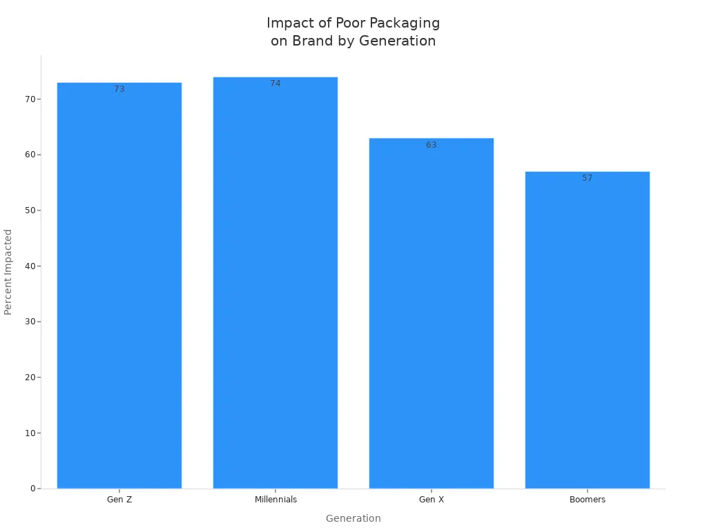
A study shows that 96% of people say packaging quality affects their trust in a brand. If you use 72 dpi images, you could lose customers. About 69% of people have gotten a badly packed order and thought less of the brand. The effect is even bigger for younger shoppers.
Statistic | Description |
|---|---|
96% | Respondents say packaging quality affects their trust (27% significantly, 42% moderately, 26% slightly). |
69% | People have received a poorly packed order that lowered their opinion of the brand. |
73% | Impact is worst among Gen Z. |
74% | Impact is significant among Millennials. |
63% | Impact is significant among Gen X. |
57% | Impact is significant among Boomers. |
Low image quality can also cause more returns and complaints. If your coffee bag has blurry labels or missing details, customers may feel upset. They might send the product back or leave a bad review. Good quality checks and high image resolution help you avoid these problems.
Evidence | Description |
|---|---|
Quality Control Measures | Implementing effective quality control can prevent product returns and damage to brand reputation. |
Quality Packaging | Quality packaging can help reduce product returns and warranty claims, highlighting the direct correlation between packaging quality and customer satisfaction. |
Labeling Quality | Misprints or missing elements on labels can undermine professionalism and lead to customer dissatisfaction, increasing the likelihood of returns. |
You want your coffee bags to look sharp and professional. High image quality and the right resolution protect your brand and keep customers happy. Avoid pixelation and blurry prints by starting with the best images you can.
Image Resolution Myths
Converting 72 DPI to High Resolution
Some people think you can make an image better by just changing the dpi in an editor. This is not true and can be confusing when making art for packaging. You might believe you can make a picture bigger or sharper by changing the dpi, but this does not add any new detail.
The ppi setting does nothing for how an image looks on your screen! If you want to stop people from printing your images large, just pay attention to the pixel size.
You should look at the pixel size of your image. The number of pixels decides how clear your print will be. Changing the dpi without adding more pixels will not make your print better. The 72 ppi rule is old and not true anymore. For screens, pixel size is what matters most.
The 72 ppi idea is old and not correct.
PPI changes how big a print is, not how it looks on a screen.
Pixel size is what matters for pictures on the web.
There is no one standard screen resolution, so if your images are for the web, you do not need to worry about image resolution!
Why Upscaling Fails
You might try to make an image bigger or sharper with upscaling software. Most programs use ways like nearest neighbor or bicubic interpolation. These tools guess what new pixels should look like, but they cannot make real detail.
Old upscaling tools cannot add new details that were not in the first image.
They use the pixels you already have and guess to fill in empty spots.
Common ways like nearest neighbor, bilinear, and bicubic interpolation all just guess at details instead of making them.
If you want your coffee bag to look nice, you need to start with good artwork. Experts say you should follow these tips for BN PACK products:
Best Practice | Description |
|---|---|
Use High-Resolution Images | Always use high-resolution files to keep your packaging looking professional. |
Understand File Formats | Give print-ready files in formats like .ai, .psd, PDF, or EPS. |
Ensure Quality Visuals | Good visuals make your brand look better and more professional. |
You should always use original, high-resolution images. If you need a bigger or sharper image, ask your designer to make new art or find a larger file. This helps you avoid blurry prints and keeps your packaging looking great.
Preparing for High-Quality Printing
Checklist for Print-Ready Images
You want your coffee bag to look neat and pro. Before you print, check these steps. This list helps you stop mistakes and makes your bag stand out.
Checklist Item | Description |
|---|---|
Proofreading | Find spelling mistakes and typos that can hurt your brand. |
Font spacing | Change tracking, leading, and kerning for easy-to-read text. |
Image size and resolution | Save images at 300 DPI or more for clear prints. |
Color accuracy | Use CMYK color mode so print colors match your design. |
Crop and bleed marks | Add crop and bleed marks to stop white edges from showing. |
High resolution PDF | Save your file as a high-res PDF to keep all details. |
Screen calibration | Calibrate your screen so colors look the same in print. |
Tip: Make your artwork go past the dieline and add a bleed of 0.125 inches or more. This stops white borders and makes your coffee bag look finished.
Tips for Designers and Clients
You can make your packaging look great by using smart tips. Both designers and clients help make print-ready images.
Use vector graphics for logos and text. Vectors stay sharp at any size.
Do not use tiny text, thin lines, or busy patterns. These can print badly.
Place images by themselves in your layout. Do not embed them.
Change fonts to outlines or send them with your files.
Set gradients from 1% to 100% dot for smooth fades.
Make barcodes 85% to 120% of the normal size. Make sure they scan well.
Change colors for the packaging material and use the right color profile.
Check a digital proof before printing. This helps you find problems early.
Aspect | Screen Display Preparation | Print Packaging Preparation |
|---|---|---|
File Preparation | Follow digital file rules for screens | Add bleeds, crop marks, and resize for print |
Color Management | Use RGB color mode | Change colors to CMYK for good printing |
Proofing Processes | Digital proofs are usually enough | Physical proofs help make sure print is correct |
Learning about image resolution and file types helps you stop blurry prints. You keep your brand safe and make your coffee bags look pro.
You can notice big differences between screen and print resolution. Images look sharp on screens, but printing needs higher resolution. If you use low resolution for print, your images will look blurry. BN PACK helps you pick good materials and gives tips for better print quality. You should follow this checklist to get your artwork ready:
Use vector graphics for each image you use.
Change all fonts to outlines before printing.
Add images and make sure they are set at 300DPI.
Keep artwork away from zipper and seal areas.
Pick special materials to get better print results.
Talk to packaging experts to make your print better and stop common mistakes.