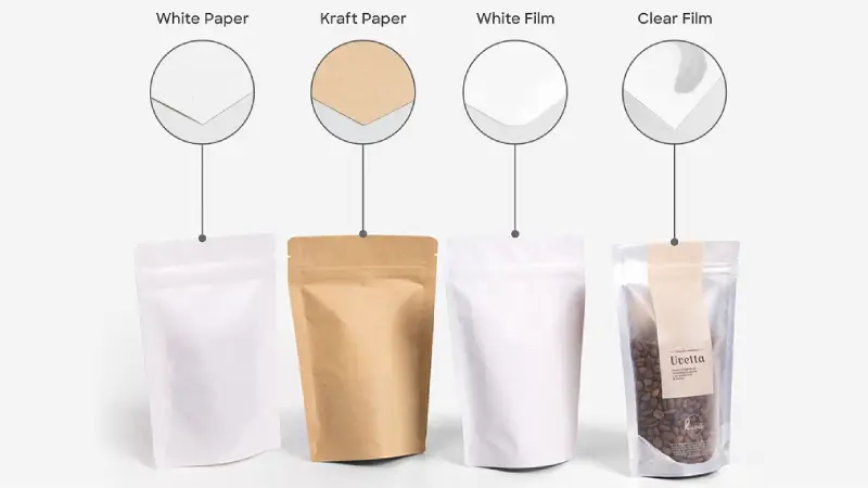
Material choice affects how colors look on packaging. When you print with CMYK on kraft paper, the ink soaks into the brown paper. If you print on glossy film, colors look brighter because the ink stays on top. You need color accuracy for your packaging design, so the material you pick is important. The printing process uses CMYK printing, ink, and color mixing to split colors. BN PACK’s high-quality print and skilled printing help your packaging use the best materials for color control, good ink, and exact color separation.
Why Your Packaging Design Looks Different in Real Life
The Core Problem: CMYK Inks are Translucent, Not Opaque
Sometimes your packaging looks different when printed. This is because cmyk ink is see-through, not solid. The ink lets some of the material underneath show. So, the color you see comes from both the ink and the material. If you want your packaging to look like it does on a computer, you might be surprised by the real thing.
Many companies have this problem. For example, Tropicana changed its packaging in 2009. People did not know the new look, and sales went down by 20%. This shows why color and design are important for packaging. If colors are not the same, it can hurt your brand and confuse people.
The “Canvas” Matters: How Base Material Impacts Color Perception
The material you pick for packaging is like a canvas. Each material works with cmyk ink in its own way. If you use white or light materials, the ink mixes well and colors look bright. If you use dark or brown materials, like kraft paper, you need a white base for bright colors. Without it, colors can look dull or muddy.
Here is a simple table that shows how materials change cmyk color:
Substrate Type | Ink Type | Effect on Color Output |
|---|---|---|
White or Light Paper | Transparent CMYK | Accurate blending and vibrant color |
Transparent CMYK | Dull colors unless you use a white ink base | |
Glossy Film | Transparent CMYK | Colors appear bright and sharp |
Matte Film | Transparent CMYK | Colors look softer and less saturated |
You should think about these things when you plan your packaging. If you want your packaging to pop, match your design, ink, and material. This helps you stop color problems and keeps your design looking good.
Tip: Always look at a real sample before you say yes to printing. This helps you find any color or design problems early.
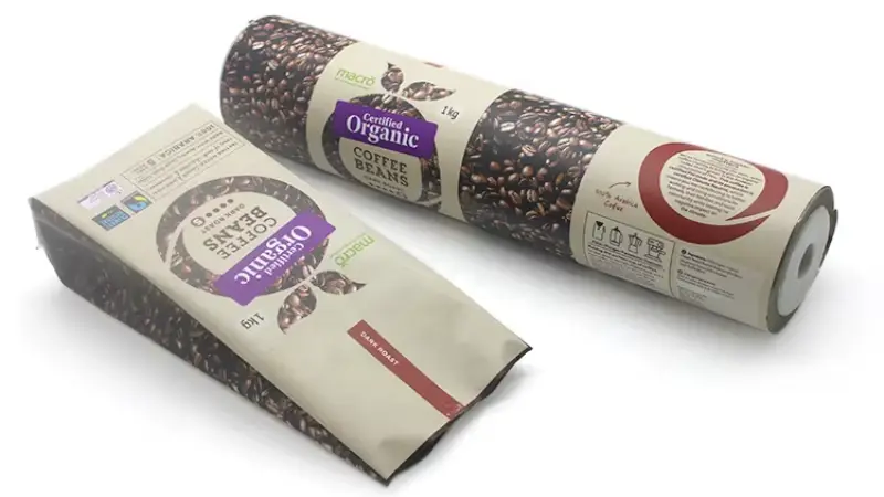
Material 1: Printing on Natural Kraft Paper (The “Soaking” Effect)

Challenges: Brown Base Color and High Ink Absorption
When you choose kraft paper for packaging, you face unique challenges. The brown base color changes how your cmyk printing looks. The ink does not sit on top of the paper. Instead, it soaks in, which makes colors look different than on white paper. You see this effect most with light colors and detailed design elements.
Why Colors Look Darker and Less Saturated on Paper
Kraft paper absorbs ink quickly. This soaking effect causes colors to lose brightness and saturation. Your packaging design may look vibrant on a screen, but after printing, the colors appear dull. The brown paper base mixes with the ink, changing the final color output.
Color will appear differently on brown kraft paper than on white paper. When printed directly on kraft paper, colors may appear duller or more muted. Light colors will show the brown of the kraft paper.
You notice this most with yellow, orange, and pastel shades. These colors almost disappear into the brown paper. Your reds and blues also lose their pop. The types of paper you choose for packaging play a big role in how your design looks.
The Risk of “Muddy” Images
High ink absorption can make your images look muddy. When you print detailed graphics or small text, the ink spreads into the paper fibers. This causes edges to blur and colors to mix. Your packaging design loses sharpness and clarity. You want your brand to stand out, but muddy images can hurt your product’s shelf appeal.
The Critical Solution: White Ink Underprinting (White Base)
How White Ink Works as a Primer
You can solve these problems by using white ink underprinting. This technique adds a white base layer before the cmyk printing. The white ink acts as a primer, blocking the brown paper color. Your colors stay true and vibrant.
Using a white ink layer enhances your prints’ color accuracy, vibrancy, and contrast. It also makes the colors look more opaque, consistent, and noticeable on dark color substrates.
Visual Comparison: Kraft with White Base vs. Without
When you print on kraft paper without a white base, the dark brown color absorbs light. The printed inks mix with the paper, causing big color shifts. Light colors like yellow almost disappear. Reds and oranges lose their brightness. If you use a white base, you prevent this mixing. Your packaging design shows true brand colors and sharp details.
Here is a simple table to help you compare:
Printing Method | Color Vibrancy | Image Clarity | Brand Impact |
|---|---|---|---|
No White Ink Base | Low | Blurry | Weak |
With White Ink Underprint | High | Sharp | Strong |
You want your packaging to look its best. Choosing white ink underprinting for kraft paper helps you achieve accurate cmyk color output and keeps your design looking professional.
Material 2: Glossy Films (The “Reflection” Effect)
Glossy Films: Maximizing Vibrancy and Contrast
Glossy films change how you see color on packaging. When you use glossy film, the surface reflects light. This reflection makes colors look brighter and more vibrant. You notice that cmyk printing on glossy film creates sharp edges and strong contrast. The ink sits on top of the film, so it does not soak in. Your design stands out because the colors stay true and bold.
You want your packaging to catch attention. Glossy films help you achieve this goal. The smooth surface lets the ink dry quickly. You see less smudging and better detail. Your cmyk colors look clean and crisp. This effect works well for designs with high contrast and bold graphics.
Tip: If you want your packaging to look premium, choose glossy film for your printing. The shiny finish makes your product look fresh and appealing.
Why Glossy Surfaces Create the “Pop” Effect
Glossy surfaces reflect light directly. This reflection boosts the brightness of your colors. The cmyk ink does not get absorbed, so the color stays on the surface. You see a “pop” effect because the design looks more intense. Your reds, blues, and yellows appear richer. The glossy finish also protects the ink, keeping your packaging looking new for longer.
Here is a simple table to show the difference:
Surface Type | Color Vibrancy | Detail Clarity | Shelf Appeal |
|---|---|---|---|
Glossy Film | High | Sharp | Strong |
Matte Film | Medium | Soft | Subtle |
Best Use Cases: Fresh Food and High-Contrast Graphics
You find glossy film packaging in many industries. The food and beverage sector uses glossy films to make products look fresh and tasty. Personal care and cosmetics brands also choose glossy films for single-use and travel-sized items. These products need strong marketing exposure. Glossy films help your design stand out on crowded shelves.
Food and beverage packaging
Personal care and cosmetics
High-contrast graphic designs
Promotional items
You want your packaging to deliver the best color output. Glossy films give you the vibrancy and detail you need for eye-catching designs. Your cmyk printing looks professional and attractive. The ink stays bright, and your brand gets noticed.
Material 3: Matte Films
How Light Diffusion Reduces Color Saturation
When you choose matte films for packaging, you notice a softer look in your design. Matte surfaces scatter light in many directions. This scattering effect reduces the intensity of color. Your cmyk printing does not appear as bold as it does on glossy films. The ink sits on the matte surface, but the texture diffuses the light. You see less shine and more muted tones.
Matte films work well for packaging that needs a natural or subtle appearance. You might want your design to feel calm or earthy. The cmyk colors look gentle and less saturated. You see this effect most with bright colors. Reds, blues, and yellows lose some of their vibrancy. Your packaging can still look professional, but the color will not pop as much.
Tip: If you want a soft, elegant look for your packaging, matte films help you achieve that style. Your design will look smooth and refined.
Why Blacks Can Look Like Dark Grey on Matte Surfaces
You may expect deep black in your packaging design, but matte films often show black as dark grey. The matte texture causes light to bounce around and creates a veiling glare. This glare lowers the density of black ink. Your cmyk printing struggles to reach true black on matte surfaces.
The difference becomes clear when you compare matte and glossy films. Glossy films reflect light directly, so black ink looks deeper. Matte films scatter light, so black appears lighter. You can see this in density readings:
Surface Type | Density Reading | Notes |
|---|---|---|
Glossy | Higher | Higher density readings due to light interaction and specular reflection avoidance. |
Matte | Lower | Lower density readings due to veiling glare and texture effects. |
Your packaging design needs careful planning when you use matte films. You may need to adjust your cmyk color choices to get the look you want. You can ask your printing partner for samples to see how your ink and color will appear. Matte films give your packaging a unique style, but you must understand how they change your design.
Technical Deep Dive: Dot Gain Differences
What is Dot Gain and Why It Changes by Material
You may notice that your packaging sometimes looks darker or less sharp than your original design. Dot gain causes this effect. Dot gain happens when the tiny dots of cmyk ink printed on your packaging spread out more than expected. The dots get bigger, so the color appears darker and less detailed. Different materials change how much dot gain you see. Kraft paper absorbs ink quickly, so the dots spread more. Glossy films keep the ink on the surface, so the dots stay smaller. Matte films fall somewhere in between.
Dot gain affects color consistency and can make your packaging design look different from your digital proof. You need to understand dot gain to keep your colors accurate.
Expected Dot Gain Values for Paper vs. Plastic Films
You can expect higher dot gain on paper than on plastic films. Paper fibers soak up ink, causing more spreading. Plastic films, especially glossy ones, resist ink absorption, so dot gain stays low. Here is a simple table to show the difference:
Material Type | Expected Dot Gain (%) | Impact on Color and Design |
|---|---|---|
Kraft Paper | 18-22 | Colors look darker, details blur |
Matte Film | 12-16 | Colors soften, some detail loss |
Glossy Film | 8-12 | Colors stay bright, sharp design |
You should always check these values when preparing your packaging artwork. If you want strong color consistency, you need to adjust your design for the material you choose.
How to Compensate for Dot Gain in Adobe Illustrator
You can control dot gain before you print your packaging. Print professionals use compensation curves to adjust for dot gain. You can follow these steps in Adobe Illustrator:
Identify the print characteristic you want for your packaging.
Measure the tone reproduction on your chosen material.
Enter the dot area for the tints you see.
Build compensation curves to adjust dot sizes in your design.
Preview your artwork with these adjustments to check color consistency.
Tip: Always ask your printing partner for advice on dot gain settings. You can use software controls to keep your cmyk colors true and your packaging design sharp.
You can use these techniques to make sure your packaging matches your brand colors and keeps your design looking professional.
Pre-press Checklist: Optimizing Artworks for Specific Materials
Adjusting Color Profiles for Coated vs. Uncoated Surfaces
You need to set the right color profile before you start printing your packaging. Coated surfaces, like glossy films, show cmyk colors with more vibrancy. Uncoated surfaces, such as kraft paper, give a softer look. You should choose a color profile that matches your material. This helps your design look the way you want. For glossy packaging, use a color profile that boosts brightness. For kraft or matte packaging, select a profile that keeps colors accurate but gentle.
Tip: Always check your color profile settings in your design software. This step helps you avoid surprises when you see your printed packaging.
Avoiding Small Text on Rough Textures (Kraft)
Kraft paper has a rough texture. Small text can blur when you use cmyk printing on this material. The ink spreads into the fibers, making details hard to read. You should use larger text and bold fonts in your design for kraft packaging. This keeps your message clear and easy to see. High-quality ink with strong pigments also helps your color stay sharp.
Best practices for kraft packaging:
Use bold fonts and larger text sizes.
Avoid thin lines and small details.
Choose ink with strong pigments for better color output.
The Importance of Physical “Wet Proofs” over Digital Proofs
Digital proofs show your design on a screen, but they do not match real cmyk printing on packaging. Physical “wet proofs” let you see how ink and color look on your chosen material. You can spot problems with color, design, or ink coverage before you print the full run. Wet proofs help you check color vibrancy on glossy packaging, softness on matte, and clarity on kraft. You make better choices for your packaging when you see a real sample.
Proof Type | What You See | Best For |
|---|---|---|
Digital Proof | On-screen colors | Quick checks |
Wet Proof | Real ink on material | Final color decisions |
Note: Always ask for a wet proof before approving your packaging design. This step protects your brand and ensures your colors look right.
Conclusion: Choosing the Right Material for Your Brand Strategy
When you pick packaging materials, you make big choices. The material changes how cmyk colors look. It also helps your brand get noticed. You want your packaging to fit your design and reach your audience.
Think about these things before you choose:
How color affects people’s feelings
Who will buy your product
What your product is and how it looks
How your packaging is different from others
What your packaging says about your product
Keeping your brand the same everywhere
What colors people like in different places
Making sure your design looks good
Colors can make people feel different things. Bright colors can make your packaging look fun and full of energy. Black can make it look fancy. You need to know what colors mean to pick the right ones for your brand and your customers.
Top packaging brands pick materials that match their design plans. You might use glossy paper for bright cmyk colors. Matte paper gives a softer look. Good ink is important. High-quality ink makes colors deeper and details clearer. This helps your packaging look nice and keeps your brand strong.
Always use your main brand colors. You can try new colors for a new product, but keep your main colors the same. Your customers need to know your brand by its colors, no matter what packaging you use.
You need to match your design, ink, and material for the best cmyk print. If you want bright colors, use glossy materials and good ink. If you want a natural look, matte or kraft paper is a good choice. Always test your packaging with real samples to see how it looks.
Material Type | Best For | Color Output |
|---|---|---|
Glossy Film | Vibrant, bold designs | Bright and sharp |
Matte Film | Subtle, elegant looks | Soft and muted |
Kraft Paper | Eco-friendly branding | Warm and earthy |
Your packaging tells your brand’s story. You control how your colors, design, and ink work together. Make smart choices so your product stands out and your customers trust your brand.
You see how material choice changes cmyk color output in packaging. Your design needs the right ink and printing method for the best results. Different materials affect how color looks and how ink sits on the surface. You want your packaging to match your brand design and stand out. BN PACK helps you choose the best packaging, printing, and ink for accurate cmyk color. Trust BN PACK to support your design goals.
Tip: Always test your packaging with real cmyk printing to check color and ink results.