
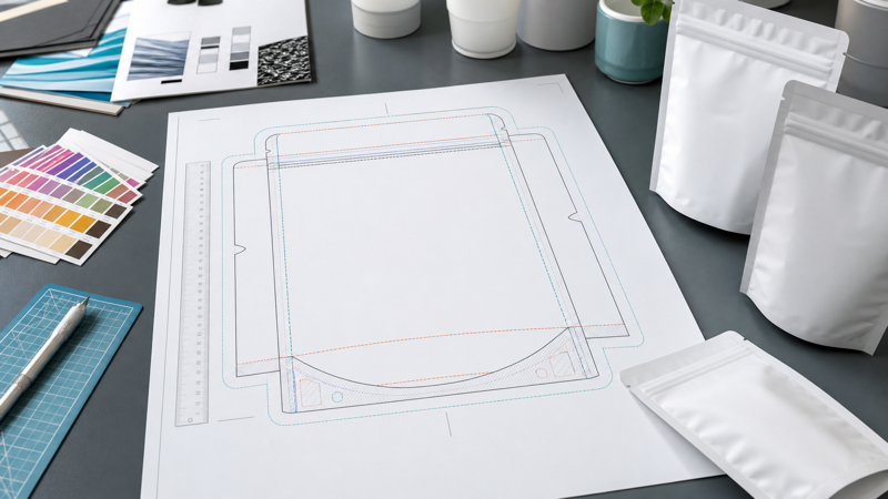
A flexible packaging dieline is the technical map that connects artwork to a finished pouch. It shows where the package will be cut, sealed, folded, punched, fitted with a zipper or valve, and transformed from a flat printed web into a three-dimensional container. When designers treat the dieline as a simple rectangle, important text can disappear into a gusset, a logo can drift toward a seal, or a barcode can wrap around a corner. Correctly reading the dieline prevents those problems before plates, cylinders, film, and production time are committed.
Every converter builds dielines around its own equipment, tolerances, pouch-making process, and material behavior. A template downloaded from the internet may be useful for early concepts, but it should never replace the production dieline supplied for the exact pouch size and structure. Before final artwork begins, confirm the finished dimensions, pouch format, zipper position, seal widths, tear notch, hang hole, valve, rounded corners, and any special features through the supplier’s how to customize packaging process.
The Lines and Zones on a Dieline
Most dielines use separate colors or layers to identify trim lines, bleed boundaries, safe zones, folds, seals, and hardware. The cut or trim line represents the intended outer edge of the finished pouch. Real production includes registration and cutting tolerances, so the actual edge may move slightly. Artwork that must reach the edge should continue beyond this line into the bleed rather than stopping exactly at the trim.
The bleed is extra printed image area outside the final cut. It prevents an unintended unprinted sliver from appearing when the pouch is cut slightly off its nominal position. The required bleed varies by converter and process; designers should use the supplied value rather than borrowing a standard from labels or paper cartons. Background colors, photographs, patterns, and other edge-to-edge elements normally extend through the complete bleed.
The safe zone sits inside the cut and other risk areas. Essential content such as the brand name, net quantity, regulatory copy, opening instructions, and barcode should remain within it. A safe zone is not merely a visual margin. It provides practical protection against registration variation, film movement, folds, seals, and the way the pouch changes shape after filling. Decorative elements can cross it, but information that must remain legible should not.
Fold lines indicate where the web turns to form sides or a bottom. They are positional references, not guaranteed razor-sharp creases. Flexible films stretch and the filled product pushes the package into a curved form, so artwork crossing a fold will not look exactly like the flat preview. Avoid placing small text, faces, fine rules, or alignment-critical graphics directly on a fold.
Seal Areas Are Functional Manufacturing Space
Seal zones are the bands where heat and pressure bond the sealant layers. Side seals, top seals, bottom seals, and fin or lap seals may appear differently depending on the pouch format. Printing may be technically possible over some seal areas, but the visual result can change because of heat, pressure, texture, distortion, or the overlap of multiple layers. Ask which areas are printable and which must remain free of ink, coatings, or variable information.
Top-seal planning must also account for filling. The area above a zipper is often removed when the consumer opens the package. Do not place lasting instructions or required declarations there unless they are intentionally disposable. Leave enough unprinted or noncritical space for the filler’s sealing jaws, lot code, date code, and any registration mark required by the equipment.
How Gussets Change Artwork Placement
A gusset expands to create volume, but it is shown flat in the artwork file. That makes it easy to underestimate how much of the design will turn under the pouch or disappear toward a side panel. On stand-up pouches, the bottom gusset is folded inward before filling. Graphics placed inside that area may be hidden on shelf and distorted when the base opens. Keep primary branding on the front and back display panels, and treat gusset artwork as secondary unless a physical sample proves otherwise.
The bottom gusset includes transition areas where several layers, curves, and seals meet. These zones can show greater movement than the center panel. Avoid precision patterns that must connect perfectly across gusset boundaries. If color continuity matters, use generous overlaps and designs that remain acceptable with normal converting tolerance.
Flat-bottom pouches can have a front, back, two side gussets, and a bottom panel. This creates five useful surfaces but also more seams and orientation decisions. Confirm which side panel appears on the left and right when viewed from the front, the direction of the bottom artwork, and the relationship between panels after the bag is formed. Add unmistakable orientation notes outside the print area so prepress does not need to guess.
Zippers, Tear Notches, Valves, and Hang Holes
Functional components need both a physical position and an artwork clearance zone. A zipper creates a raised band that can interrupt small type and alter appearance. The tear notch must line up with the intended opening path without cutting through instructions or a key visual. A hang hole removes material and may sit near the top seal, while a degassing valve occupies an area that should not contain a barcode, small text, or a face in a photograph.
Dimensions should be referenced from stable manufacturing edges, not estimated from the illustration. Confirm whether a valve position is measured to its center, edge, or flange. For a zipper, distinguish the zipper profile from the top of the pouch and from the consumer cut line. If several features compete for limited header space, enlarge the package or simplify the artwork rather than compressing everything into a fragile layout.
Dielines for Common Pouch Formats
Three-side seal pouches usually present a simpler front-and-back canvas, but the three perimeter seals still reduce usable space. Confirm which edge remains open for filling and where the final seal will be made. For preformed pouches, the customer’s top seal may differ slightly from the converter’s factory seals, so keep critical artwork away from both.
Rollstock dielines are based on repeat length, web width, lane arrangement, eye marks, and the forming path of the filling machine. The center of a flat web may not become the center of the finished front panel. Fin seals and lap seals also consume material differently. The equipment supplier and converter should agree on unwind direction, print orientation, eye-mark location, seal type, and cutting reference before artwork approval.
Spouted pouches, shaped pouches, and pouches with handles need additional clearance around inserted or cut features. Curved outlines can make a design look dynamic, but text must follow the usable safe area rather than the outside silhouette. The more complex the geometry, the more valuable a white mock-up and digitally printed prototype become.
Building an Artwork File the Converter Can Use
Keep every dieline element on a clearly named, locked layer. Place artwork on separate layers for process colors, spot colors, white ink, varnish, metallic effects, and variable elements. Never flatten the dieline into the artwork or delete technical marks before submission. Use the converter’s required color names and overprint settings so production separations are unambiguous.
Create the artwork at full scale unless the supplier specifies a documented scale. Outline fonts or package them according to the prepress requirement, embed linked images, and maintain adequate effective resolution. Check transparency effects, small reversed text, line weights, and barcodes at final size. A large monitor view can hide weaknesses that become obvious on the physical pouch.
Before release, print the dieline at 100 percent, trim it, fold the gussets, and place a product or filler inside. This simple paper model reveals inverted panels, hidden copy, poor hierarchy, and feature conflicts. It does not predict film color or seal behavior, but it is an excellent orientation check.
Final Dieline Approval Checklist
- Use the converter’s current production dieline for the exact structure, size, and pouch format.
- Extend edge-to-edge backgrounds through the full specified bleed.
- Keep essential copy, barcodes, and logos inside approved safe zones.
- Treat folds and gusset transitions as distortion areas, not precision alignment points.
- Confirm all seal widths, filling openings, and customer-applied final seals.
- Mark zipper, notch, valve, spout, hang-hole, and date-code clearances.
- Verify front, back, side, bottom, unwind, and print orientations with a physical mock-up.
- Separate technical dieline elements, white ink, spot colors, varnishes, and artwork into named layers.
- Obtain written prepress approval before plates, cylinders, or production are released.
A good dieline makes manufacturing constraints visible while there is still time to change the design. It protects brand presentation, regulatory information, package function, and the production schedule. The most reliable workflow is to obtain the exact template early, design around functional zones, test the three-dimensional form, and keep the converter involved through final prepress approval.