When you use multiple packaging suppliers, maintaining brand color consistency can be challenging. The right colors help your coffee bags stand out and make your brand easily recognizable. Colors do more than just look appealing; they build trust, evoke positive feelings, and foster connections with your customers. For example:
Choosing consistent colors shapes your brand identity and makes your products memorable.
Colors like red, blue, green, and gold convey different messages to consumers.
Thoughtful color choices can demonstrate your commitment to sustainability and enhance product visibility.
If your packaging colors are inconsistent, your brand may weaken, and your product might not catch the eye on retail shelves. You could even incur additional costs to rectify these discrepancies. Implementing a standardized approach to ensure brand color consistency is essential for protecting your brand and keeping your coffee bags looking great across all platforms.
Why Brand Color Consistency Matters
Brand Recognition and Trust
You want people to spot your brand right away. Using the same color on all packages helps with this. A special color can make your brand easier to remember. People are more likely to buy your products if they see the same color every time. Trust is important for keeping customers loyal. Studies show most people buy from brands they trust. Keeping your colors the same helps build trust. Research says brands with steady messages get stronger feelings from people. If you use the same color, people remember your brand and buy again.
Impact on Coffee Bag Packaging
Coffee bags do more than hold beans. They show your brand’s story and catch people’s eyes in stores. Using the same color makes your bags look neat and nice. Makers of packaging know color affects what people expect. Pink can make people think of sweet things. Green can make people think of sour things. The table below shows how color changes what people choose:
Evidence Description | Key Findings |
|---|---|
Color influences sensory expectations | Different colors make people expect certain tastes, like sweet for pink and sour for green. |
Visual characteristics impact attention | Color is a big reason people buy things, making up most of their choices. |
Crossmodal correspondence | Some colors match certain flavors, changing how people see the product. |
If your coffee bags have different colors, people might get confused. Your brand could look bad. Here are some problems that happen when colors do not match:
People complain about colors that do not match, which confuses them and makes them think less of your brand.
If colors are not the same, products can look cheap and not well made, hurting your brand’s image.
Wrong colors can slow down making products and cause late launches, making things worse for your brand.
You can stop these problems by working with packaging makers and keeping colors the same. This helps your brand stay strong and makes your coffee bags look good.
Standardizing Colors Across Suppliers
It can be tough to keep your brand colors the same with different packaging makers. But you can make it easier by using some simple steps. You want every coffee bag to have the same color. This helps your brand look strong and trustworthy.
Using Pantone and Physical Color Cards
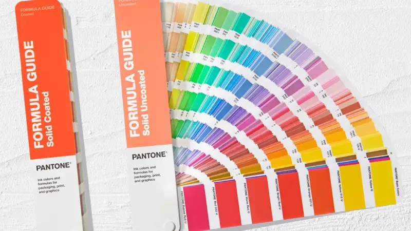
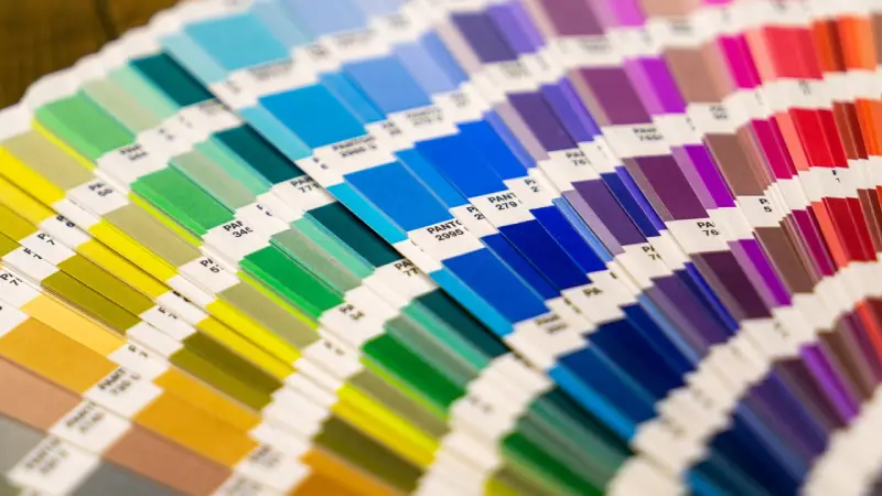
Pantone Matching System (PMS) helps you keep your brand colors the same. Pantone gives you color codes that everyone can use. This makes it easy for all your suppliers to match colors. Physical color cards show the exact color you want. When you give these cards to your packaging makers, they know what color to use. BN PACK uses Pantone codes and color cards for every coffee bag order. This keeps colors the same, even if you use different printing or materials.
PantoneLIVE is a digital tool that saves your brand colors online. You can share your color palette with all your suppliers. This helps everyone check and match the right color. ColorCert is a tool that shows you print quality and color accuracy right away. You can see if the color is correct before making all the bags.
Tip: Always tell your suppliers to use the same Pantone code. Check the color with a physical card before making your coffee bags.
Creating a Brand Color Manual
A brand color manual helps you keep colors the same. This manual tells everyone which colors to use and how to use them. You should add Pantone codes, color samples, and rules for each color. BN PACK helps clients make clear color manuals for coffee bag packaging. This makes sure every supplier follows the same rules.
Here are the main parts of a good brand color manual:
Component | Description |
|---|---|
Brand Standards Guide | A manual that lists the exact colors for your business. |
Color Matching Tools | Tools like spectrophotometers that check color accuracy. |
You should also:
List your main and extra colors, and show where to use them.
Give easy instructions for using colors in print, online, and social media.
Add pictures or samples to show what the final product should look like.
A digital library helps you share your manual with all suppliers. This stops confusion and helps everyone keep colors the same.
Material and Substrate Considerations
Different materials can change how your brand colors look. You need to think about this when picking packaging for your coffee bags. Glossy materials make colors look brighter. Matte finishes make colors look softer and lighter. Textured materials can make colors look uneven. Uncoated paper can make colors look dull.
Material Type | Color Effect | Considerations |
|---|---|---|
Glossy | Brighter, more vibrant colors | Good for bold, fancy packaging. |
Matte | Softer, lighter colors | Colors may look lighter. |
Textured | Uneven color, different reflections | May need more ink for even color. |
Uncoated Paper | Dull colors, more ink absorption | May need special ink for the right color. |
You should always test your colors on the real material before making a big order. This helps you see if the color matches your brand color manual. BN PACK checks color consistency on every material used for coffee bags. This keeps your brand colors the same, no matter what material you pick.
Note: Industry standards like ISO and DeltaE help you check if the color is close enough to your target. You can use these tools to set clear rules for color differences.
By following these steps, you make sure your coffee bags always have the same color. This helps your customers trust you and keeps your brand looking good.
Communicating Specifications to Suppliers
Talking clearly with your packaging makers is very important. This helps keep your brand colors the same. You want every supplier to know what you expect for color. BN PACK always gives partners detailed color goals and written rules. Doing this stops confusion and keeps your coffee bags looking alike, no matter who makes them.
Sharing Color References and Targets
You should always give your suppliers clear color samples. This helps everyone match the right color. Here are some good tips:
Use CMYK color mode for all design files. This matches print colors better than RGB or HEX.
Give design files with the right colors, not just codes. This helps stop mistakes.
Use spot colors like Pantone for big color areas. This helps keep colors the same.
Share real color swatches or cards with your suppliers. These show the exact color you want.
Ask for print samples before making all the bags. This lets you check the color early.
Calibrate your screens and compare with real swatches. This makes sure what you see matches what gets printed.
You can also tell suppliers how screen colors and printed colors are different. This helps everyone know what to expect and keeps colors the same.
Supplier Agreements and Expectations
You need to put your color rules in every supplier contract. Written rules and real color samples help suppliers follow your wishes. Many big brands, like Nike and Airbnb, use clear rules to keep their look strong. You can do this for your coffee bags too.
Here is a table with important contract rules for suppliers:
Aspect | Description |
|---|---|
Approved Use Cases | List where your logo and colors can be used, like on packaging or ads. |
Visual Requirements | Set rules for how your logo looks, color choices, and smallest sizes. |
Restrictions | Explain what suppliers cannot do, like changing colors or using the logo wrong. |
Approval Process | Tell how to get final approval for color and design before making products. |
Ownership Rights | Make clear that your brand owns the logo and color rules. |
Term and Termination | Say how long the contract lasts and when it can end. |
By doing these things, you help your packaging makers keep your brand colors the same. This builds trust and keeps your coffee bags looking good on every shelf.
Proofing and Color Management
Requesting Proofs and Samples
You should check your coffee bag colors before making many bags. Proofing lets you see if the color matches your brand. Packaging makers use steps to make sure colors look right. You can ask for drawdowns, hard proofs, and on-site press approvals. Each step shows the color on the real material and under good lighting. This helps you find mistakes early and fix them.
Proofing Phase | Description |
|---|---|
Drawdowns | Custom ink builds match Pantone colors. They are put on the material and checked under good lighting. |
Hard Proofs | Process colors are checked against your targets. You can make changes before making all the bags. |
On-Site Press Approval | Checks if colors are correct and sets rules for future orders. Everyone agrees on the color. |
Keeping colors the same is important for print marketing. Colors can look different on each material or in different lights. Tools like Pantone Matching System help you keep colors true.
Tip: Always ask for samples before you say yes to a big order. This step protects your brand and saves time.
Color Management Tools and ICC Profiles
You can use color management tools to keep colors right. ICC profiles help match colors on screens and printers. These profiles fix problems with device differences and color ranges. ICC profiles give you a way to change colors that works every time. You get the same color no matter where you print.
ICC profiles keep color the same on all devices.
They fix problems with different devices and color ranges.
ICC profiles make changing colors easy and reliable.
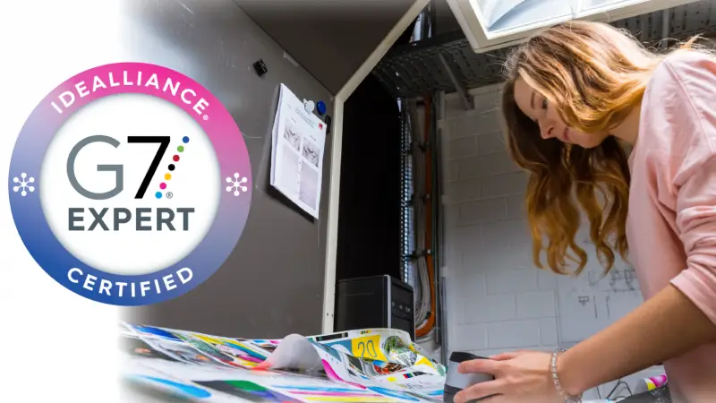
G7 Certification and Quality Control
G7 certification helps keep your coffee bag colors steady. This standard makes sure your packaging matches your brand. G7 lowers the risk of color changes on different materials or machines. You can trust reprints to look like the first ones. G7 also makes printed things better and keeps color steady everywhere. Customers notice when your packaging always looks right. This helps people trust your brand.
G7 makes sure colors are printed right.
It lowers the chance of color changes.
You get better quality and steady colors.
Customers trust your brand when colors stay the same.
By using proofing, color management tools, and G7 certification, you make sure your coffee bags always show your brand colors the right way.
Overcoming Common Challenges
Print Technology Differences
Different printing methods can change the color on your coffee bags. Each method uses its own process and ink. This can make it hard to keep colors the same. Some problems you might see are:
Monitors that are not set up right can show colors wrong.
Using the wrong light can make colors look different.
Bad ICC profiles can make colors not match on devices.
If the color workflow is not good, mistakes can happen.
Spectrophotometers that are not set up right can give wrong color results.
BN PACK fixes these problems by using color calibration tools. They also follow strict color rules. You should check if your suppliers use the right tools and profiles. Teach your team and suppliers about color theory and calibration. This helps everyone know what to expect.
Substrate and Finish Variations
The material and finish of your coffee bag can change the color. For example:
Printing on foil, kraft paper, or plastic can make ink look different.
Glossy finishes make colors bright. Matte finishes make colors soft.
Store lights can make colors look different than in the print shop.
You should test your brand colors on the real material before making many bags. BN PACK checks color on every material to keep your brand strong. This step helps you avoid surprises and keeps your brand colors the same.
Ongoing Supplier Collaboration
Working with your suppliers helps keep your colors right. You can use a color management system with spectrophotometers and special software. This helps match colors on different materials and print methods. Regular checks and talking with suppliers help you find problems early.
You should include all partners in the color process. Share your color rules and look at samples together. This teamwork makes sure your coffee bags always have the same color and support your brand.
You can keep your brand colors the same by making clear rules, giving color codes, and checking samples from each supplier. Companies like BN PACK use Pantone codes, screen checks, and spectrophotometers to make sure colors do not change. Working with your suppliers all the time helps you find problems early and fix them fast. Doing these things helps people know your brand and makes customers happy.
Benefit | Measurable Impact |
|---|---|
Improved Brand Recognition | Goes up by as much as 80% |
Reduced Waste | Goes up by 15-20% |
Enhanced Customer Satisfaction | More customers come back |
Stronger Competitive Positioning | Makes more money and helps the planet |
Always work with your partners so your coffee bags show your brand’s real colors.