
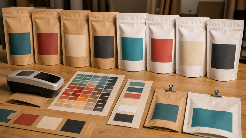
Kraft paper gives flexible pouches a natural, tactile appearance, but it also introduces color behavior that differs from white film. The brown or white paper surface, fiber pattern, coating, adhesive, printing ink, and laminated film all influence the result. Two pouches printed with identical artwork can appear different when the paper shade or structure changes, and a color that looks vivid on screen may become muted on an uncoated brown base.
Color variation can be reduced, measured, and managed, but not eliminated by artwork settings alone. Brands need to define the material, choose an appropriate ink strategy, approve a physical target, and agree on realistic tolerances with the converter. The goal is repeatable commercial appearance across acceptable manufacturing variation—not a promise that every fibrous surface will look identical.
Why Kraft Color Varies
Kraft is made from natural fibers whose shade and formation can vary with pulp source, recycled content, bleaching, coating, basis weight, and production batch. Brown kraft may range from warm golden tan to darker gray-brown. White kraft can vary in brightness and warmth. Fibers, specks, and local density create a textured background that shows through translucent inks.
In a flexible laminate, the visible “kraft” layer may be genuine paper, a coated paper, or a printed kraft-look film. Each has different color behavior. Genuine paper offers authentic variation and texture but can absorb ink and scatter light. A film imitation can provide greater uniformity and moisture resistance, though it may not have the same tactile character. Freeze the exact structure before setting a color standard.
Brown Kraft and White Kraft Are Different Design Bases
Brown kraft paper bags make the substrate an active part of the design. Unbacked process inks blend optically with the brown base, reducing brightness and shifting hue. Light colors and pastels are particularly affected because conventional inks do not contain enough opacity to hide the paper. Dark colors may reproduce more strongly but can lose shadow detail.
White kraft paper bags provide a lighter, more neutral printing surface. They can support brighter process color, cleaner photography, and more predictable neutrals while retaining a paper feel. However, white kraft is not necessarily equal to white plastic film or coated proofing paper. Brightness, surface texture, and ink absorption still affect color.
Choose between brown and white kraft according to the visual priority. If the brand wants an unmistakably natural background and accepts muted color, brown kraft may be ideal. If precise multicolor graphics and clean product photography are essential, white kraft or a film-based kraft simulation may provide better control. Trying to force white-film color onto brown paper can lead to excessive ink, repeated corrections, and unrealistic expectations.
Use White Ink Strategically
Opaque white ink can isolate printed colors from brown paper. It may sit beneath a logo, photograph, barcode, or block of small text, creating a more neutral base. It can also be printed as a visible design color. The white plate should be supplied separately and matched to the converter’s requirements for naming, trapping, opacity, and print sequence.
Selective white backing can create intentional contrast. Unbacked areas retain the natural paper influence, while backed areas appear cleaner and brighter. This effect works well for bold icons, product names, and simple images. Registration tolerance must be considered: if the white plate extends beyond the color, a pale halo can appear; if it is inset too far, a brown outline may show. Use the converter’s choke value rather than drawing a hairline manual adjustment.
Choose CMYK and Spot Colors for the Right Jobs
CMYK is efficient for photographs, gradients, and broad color ranges, but every process color is affected by the paper. The article on CMYK on brown paper explains the fundamental limitation: subtractive inks assume light reflected from the surface, and brown paper reflects less neutral light than white stock. A monitor preview cannot reproduce this interaction faithfully.
Spot colors can improve control for important brand hues because the ink is mixed specifically rather than built from several halftone screens. Dense spot colors may look cleaner and show less registration sensitivity in logos or large solids. They still interact with the substrate, however, so a Pantone swatch printed on coated white paper is not a literal prediction of the kraft result.
Decide which colors are commercially critical. A brand may reserve spot ink and white backing for its main logo while allowing secondary illustrations to print as process color directly on kraft. This controls cost and focuses precision where consumers notice it. Too many spot colors increase plates or cylinders, press stations, setup, and wash-up.
Create a Kraft-Specific Color Target
Do not approve kraft color from a phone, monitor, office printer, or standard paper proof alone. Those tools can confirm content and approximate hierarchy, but they cannot reproduce substrate shade, ink absorption, white opacity, fiber variation, lamination, and surface finish. Request a proof or sample that is explicit about what it can and cannot predict.
The strongest visual target is a signed production sample made with the approved structure and process. If that is unavailable, use a printed drawdown or press proof on the intended substrate. Identify the sample by specification, date, artwork version, and production method. Retain protected master samples for future orders, because an unlabeled pouch from a sales meeting is a weak standard.
Control Paper and Ink in Production
Specify the paper supplier, grade, shade, basis weight, coating, and acceptable lot variation where these are important. Ask the converter to avoid mixing visibly different paper lots within one delivery when possible. If a raw-material change is necessary, require notification and a color review before full production.
During printing, control ink formulation, viscosity, pH where applicable, anilox or gravure cell volume, impression, drying, web tension, and press speed. Paper can draw ink differently as conditions change. Record the approved setup and use retained ink recipes for repeat orders, while recognizing that adjustment may be required for a new substrate lot.
Inspect color after lamination and curing, not only at the press. Laminating adhesive and clear outer film can deepen color or change gloss. Matte surfaces scatter light and can make colors look softer; gloss increases contrast and apparent saturation. Compare samples after the same conditioning period and under standardized lighting.
Design Artwork That Tolerates Natural Variation
Kraft performs best when the design respects the material. Bold shapes, limited palettes, strong contrast, and intentionally natural imagery tend to accommodate fiber variation. Very light tints, neutral grays built from several process colors, smooth dark gradients, and large fields that must appear perfectly uniform can be more challenging.
For a broad range of kraft paper bags, build a material-specific artwork version rather than reusing the white-film file unchanged. Adjust contrast, simplify shadows, enlarge fine reversed type, and define the white plate. This preserves brand character while acknowledging the different visual medium.
Set Acceptance Criteria Before Ordering
Color disputes often arise because “match the approved sample” was never defined precisely. State which elements are critical, which sample controls, how the sample will be illuminated, and what instrumental tolerance applies. Also define acceptable kraft shade, fiber marks, specks, coating variation, and within-pouch or pouch-to-pouch variation.
Sampling should cover the beginning, middle, and end of the run and, where relevant, different rolls or lanes. Evaluate filled pouches because curvature, headspace, and product color can alter perception. Separate true color problems from differences caused by gloss, viewing angle, or the paper’s natural formation.
If a result falls outside the target, identify whether the change comes from paper shade, white opacity, ink, lamination, surface finish, or measurement method before adjusting the artwork. Correcting the wrong variable can improve one batch and make the next repeat less stable.
Kraft Color-Control Checklist
- Freeze the exact paper grade, shade, coating, laminate, and surface finish.
- Choose brown or white kraft according to the required color brightness and natural appearance.
- Define selective or flood white ink, opacity expectations, and converter-approved trapping.
- Reserve spot inks for commercially critical colors where they add measurable value.
- Approve color on the finished commercial structure, not only on screen or office paper.
- Identify a signed master sample and record measurement conditions for critical colors.
- Control paper lots, ink formulation, press settings, lamination, curing, and viewing light.
- Design with enough contrast and simplicity to tolerate normal fiber and shade variation.
- Inspect representative samples across the run and agree on limits before mass production.
Consistent kraft packaging starts with realistic intent. Natural paper variation is part of the material’s appeal, but it must be separated from uncontrolled printing variation. By selecting the right substrate, using white and spot inks deliberately, approving a physical target, and controlling production data, brands can achieve a recognizable and repeatable look without stripping kraft of its authentic character.