Walk into any specialty coffee shop today and you’ll see it immediately: packaging that looks like it was considered, not just chosen. The bag is no longer a container. For most consumers, it’s their very first interaction with your coffee — before they’ve ever smelled a grind or tasted a sip.
Designing a coffee bag well means balancing a surprising number of competing demands: barrier protection, shelf presence, brand identity, regulatory labeling, sustainability, and cost. This guide breaks all of it down, in plain language, for roasters and coffee brand founders who want to get it right.
Why Coffee Bag Design Is More Than Aesthetics

Most conversations about packaging start with colors and logos, but the decisions that matter most are structural. The bag you choose determines how long your coffee stays fresh, how it ships, how it sits on a shelf, and what information you can fit on it.
Design decisions also compound. A material choice affects printability. A bag shape affects how much label surface you have. A surface finish affects how premium a bag feels to hold. Getting these fundamentals right before you open a design brief will save you significant time and money later.
Step 1: Choose the Right Bag Structure
The shape and format of your bag is the foundation of everything else. Here are the most common formats and when each makes sense:
Flat-Bottom Bags (Block-Bottom Bags)
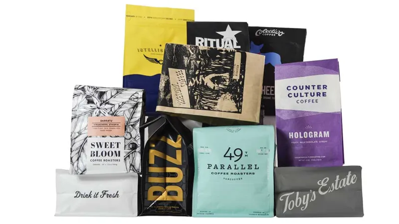
Flat-bottom bags have a rectangular base that lets them stand upright without support. They offer four or five printable panels, which makes them ideal for brands with a lot to say — origin stories, tasting notes, certifications. They’re widely considered the most premium-looking format in retail coffee, and their stable base makes them easy to display without risers or fixtures.
Best for: specialty roasters, retail-focused brands, premium single origins.
Stand-Up Pouches (Doypacks)
Stand-up pouches are the workhorse of coffee packaging. They’re cost-effective, widely available, seal reliably, and look good at virtually every price point. They typically have two or three printable panels and can be fitted with zippers, valves, and windows.
Best for: emerging brands, e-commerce-first roasters, variety packs, and competitive price points.
Side Gusset Bags
Side gusset bags expand on the sides when filled and are designed for high-volume products. They don’t stand on their own as cleanly as flat-bottom formats, but they hold more coffee per bag and are commonly used for 500g, 1kg, and larger formats sold wholesale or through subscription.
Best for: wholesale accounts, large-format retail, subscription coffee brands.
Quad-Seal Bags
Similar to side gusset bags, quad-seal formats have sealed seams on all four sides, giving a more pronounced rectangular silhouette. They offer extra side panels for design elements and tend to hold their shape well both on shelf and in transit.
Step 2: Understand the Freshness Requirements First
Before any graphic designer opens a file, you need to know what your bag needs to do physically. Freshly roasted coffee releases carbon dioxide for days after roasting — a process called off-gassing. If this gas has nowhere to go, it will build up inside a sealed bag and compromise both the seal and the coffee.
One-Way Degassing Valves
A one-way valve allows CO₂ to escape while preventing oxygen from entering. If you’re packaging coffee within a few days of roasting, a valve is not just a feature — it’s a structural requirement. Without one, bags can balloon and eventually fail.
The valve itself is small (typically 10–11mm in diameter) and can be placed on the front panel in a way that fits naturally within the design, or on the back panel to keep the front clean.
Barrier Materials
Coffee’s enemies are oxygen, moisture, light, and heat. The material layers of your bag determine how well it resists each of these. Common material constructions include:
- Kraft paper + foil laminate: Natural appearance, strong barrier, popular in specialty coffee. Less suitable for humid climates unless the inner layer is reinforced.
- Matte or glossy film laminates (PET/PE/foil): High barrier, excellent printability, the most common choice for high-volume production.
- Recyclable mono-material films: Growing rapidly in the market as brands respond to sustainability pressure. Barrier performance has improved significantly in recent years.
- Compostable films: The most eco-friendly option, though typically at a higher cost and with shorter shelf-life ratings than conventional films.
The right material depends on your expected shelf life, distribution conditions, and brand positioning. If your coffee moves from roast to consumer in under two weeks, you have more flexibility. If you’re selling through retailers with 3–6 month shelf expectations, you’ll need a more robust barrier.
Resealable Closures
Once a customer opens the bag, they need a reliable way to reseal it. The two most common options are:
- Resealable zipper (press-lock): Clean, reliable, intuitive. Works well across all bag formats.
- Tin tie: Typically seen on craft/artisanal brands. Adds a tactile, handmade feel but is less airtight than a zipper.
Step 3: Define Your Brand Before You Design
Packaging is not branding, but it is the most tangible expression of your brand. Before discussing colors and typography, get clear on a few things:
Who are you for? The visual language of a coffee brand aimed at specialty enthusiasts is very different from one aimed at everyday drinkers. Neither is wrong — they’re just different jobs. Your packaging should feel like a natural fit for the shelf, café counter, or website where it will live.
What do you want people to feel when they hold it? Tactile experience matters. A soft-touch matte laminate feels different from a high-gloss finish. A kraft paper bag signals something different than a silver foil one. These are real signals that customers use — consciously or not — to make assumptions about your coffee.
What’s your visual anchor? For most brands, this is the logo. For others, it’s a dominant color, an illustration style, or a consistent typographic approach. Whatever it is, it should be clear enough that someone recognizes your bag from across a room before they read a word.
Step 4: Design the Panels Intentionally
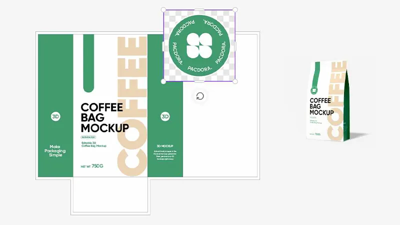
Each panel of a coffee bag serves a different purpose. Treating them as one continuous surface is a common mistake.
Front Panel
This is your shelf impression — the one moment you have to stop someone mid-stride. It should communicate your brand immediately, without requiring any reading. Keep it clean. Hierarchy matters: brand name or logo first, then product name or variant (e.g., “Ethiopian Yirgacheffe” or “House Blend”), then secondary detail.
Back Panel
This is where you can say more. Roast level, tasting notes, origin story, brew suggestions, certifications, and required regulatory information (ingredient list, weight, manufacturer details) all belong here. Think of the back panel as your conversation with someone who has already picked the bag up — they’re interested, so now you can be informative.
Side Panels (where applicable)
Flat-bottom and quad-seal bags give you side panels that many brands underuse. These are good places for secondary branding elements, a short statement, a repeated logo mark, or a design pattern that makes the bag look interesting from the side — important on retail shelves where bags are often displayed at an angle.
Bag Base
The base is visible when a flat-bottom bag is sitting on a table or counter. Some brands print here, others leave it plain. At minimum, it shouldn’t look unfinished.
Step 5: Typography and Color
Typography
Your font choices signal your brand’s personality before anyone reads a single word. A few principles:
- Use no more than two typefaces on the bag — one for headlines/brand name, one for body copy and details.
- Make sure your primary type is legible at small sizes. A gorgeous editorial typeface that becomes unreadable on a 2mm detail line is not useful.
- High contrast between type and background is essential for readability — and often legally required for certain label elements.
- Vintage, serif, or hand-lettered fonts communicate craft and tradition. Geometric sans-serifs communicate modernity and precision. Neither is better; match to your brand.
Color
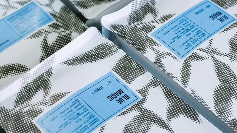
Coffee packaging tends toward warm, earthy palettes — browns, tans, creams, terracotta — because these feel natural and familiar. Breaking from this convention can make a brand stand out, which is a legitimate strategy, but it needs to be deliberate.
Whatever palette you choose, test it in context. A color that looks sophisticated on a screen can look muddy printed on kraft paper. A color that feels unique in isolation might disappear against the other bags around it on a shelf. Get physical samples before finalizing.
Step 6: Required Labeling and Compliance
Depending on where you sell, your packaging may be legally required to display specific information. This varies by country and region, but common requirements include:
- Net weight (and sometimes volume)
- Country of origin
- Ingredient list (for blended products or flavored coffees)
- Allergen declarations
- Manufacturer or distributor name and address
- Best before or roast date
- Nutrition facts (required in the US, Canada, EU, and many other markets)
- Recycling or disposal guidance (increasingly required in EU markets)
Check the regulations for every market you plan to sell in before finalizing your design. Retrofitting compliance information onto an already-finished design is painful and often looks like an afterthought.
Step 7: Printing Methods and Their Implications
The print method you choose affects minimum order quantities, cost per unit, color accuracy, and lead times.
Digital printing is ideal for small runs (typically under 1,000–2,000 units) and for brands that need to test designs, offer many SKUs, or rotate seasonal products frequently. Colors are generally very accurate and there are no plate costs. Per-unit costs are higher at scale.
Flexographic printing suits medium to large runs. It’s faster and more cost-effective per unit than digital at volume, but requires printing plates which add upfront cost and make design changes more expensive.
Rotogravure (gravure) printing is used for high-volume production and delivers exceptional color depth and consistency. It requires the highest minimum quantities and the most significant tooling investment, but produces the most visually refined results.
When briefing a manufacturer, ask for printed proofs (not just digital mockups) before approving a production run. Colors shift between screen, proof, and final printed bag — especially on textured or kraft materials.
Common Design Mistakes (and How to Avoid Them)
Overcrowding the front panel. The urge to communicate everything is understandable, but restraint on the front panel almost always improves shelf performance. Move secondary information to the back.
Ignoring the physical experience. A bag that photographs beautifully but has a flimsy feel, a valve that’s difficult to open, or a zipper that doesn’t seal properly will disappoint the customer at the moment it matters most. Finish and function are as important as visual design.
Designing for screen rather than print. Coffee bags are a physical product. Small gradients, very fine type, and certain color combinations can degrade in print — especially at small bag sizes. Always get a physical sample before production.
Skipping the fit test. Coffee beans vary in density by origin and roast level. A bag that holds 250g of one coffee comfortably may be too small or too large for another. Physical testing before committing to a format is essential.
Treating sustainability as a checkbox. Eco-friendly materials are increasingly important to coffee consumers, but choosing a compostable film just to add a logo to your bag is not a strategy. Be honest about what you’re using and why. Customers are more sophisticated about greenwashing than they used to be.
Packaging Design Trends Worth Knowing
A few directions that have gained significant ground in specialty coffee packaging:
Minimalism and restraint. Many of the most-discussed packaging designs in specialty coffee use very little visual information — a single color, a simple mark, generous white space. This works particularly well for brands positioning in the premium tier, where confidence and restraint signal quality.
Illustrated storytelling. Origin-focused brands have increasingly adopted custom illustration to tell the story of where and how a coffee was grown. This creates a distinct visual identity that’s hard to copy and communicates provenance in an immediate, emotional way.
Universal bag design with variable labels. Particularly practical for roasters with frequently rotating single origins: one bag design with the brand identity fixed, and a printed or hand-applied label that carries the SKU-specific details. This reduces inventory complexity and minimum order requirements significantly.
Sustainable materials, front and center. Brands are increasingly making their material choices a feature, not a footnote — prominently communicating compostability, recyclability, or recycled content as part of the design narrative.
Summary: The Questions to Answer Before You Start
Designing a great coffee bag is easier when you’ve answered these questions clearly before briefing a designer or manufacturer:
- What bag format best suits your product weight, retail channel, and brand positioning?
- What freshness requirements does your distribution timeline create — and does your bag meet them?
- Who is your customer, and what does the packaging need to make them feel?
- What information is legally required in your markets of sale?
- What is your expected volume, and which print method is appropriate?
- What surface finish, material, and structural features align with your brand and your sustainability commitments?
Get these right, and the visual design becomes much easier to execute well.
Looking for specific bag formats, materials, or printing options for your coffee brand? Browse our custom coffee bag range or reach out directly — we work with roasters from small-batch startups to large-scale operations.
Frequently Asked Questions
What is the most important technical feature of a coffee bag?
A one-way degassing valve is critical if you’re packaging coffee within a few days of roasting. Without it, CO₂ buildup can compromise the bag seal. Beyond that, an effective oxygen barrier and a reliable resealable closure have the most direct impact on coffee freshness.
What bag format is best for a new coffee brand?
Stand-up pouches are the most practical starting point — cost-effective, versatile, and available from most manufacturers with no minimum order requirements for digital printing. Flat-bottom bags offer more shelf presence and are worth the upgrade as volumes increase.
How do I decide between kraft paper and foil bags?
Kraft paper signals craft and naturalness and works well for artisanal brand positioning. Foil laminates provide a stronger barrier and a more premium visual impact. The right choice depends on your brand identity, shelf-life requirements, and the markets you serve.
What information must I include on a coffee bag?
At minimum: net weight, origin, roast date or best before date, and manufacturer details. In most markets, a full nutrition facts panel is required. Regulations vary by region, so always verify requirements for each market before finalizing your design.
Can I use eco-friendly materials without compromising freshness?
Yes — recyclable and compostable films have improved significantly. However, they typically have shorter shelf-life ratings than conventional foil laminates, so they work best for brands with a short roast-to-consumer timeline. Discuss barrier performance specifics with your manufacturer.
How many colors can I print on a coffee bag?
With digital printing, full-color printing is standard with no additional cost per color. With flexographic or gravure printing, each color requires a separate plate. Most commercially printed coffee bags use between 4 and 8 colors.