
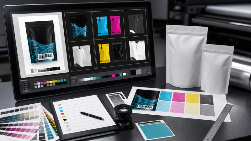
Packaging artwork is not ready for production simply because it looks finished on screen. A flexible pouch file must survive color separation, plate or cylinder preparation, web printing, lamination, slitting, pouch forming, filling, sealing, and retail use. A missing font, incorrect spot-color name, low-resolution image, or misplaced barcode can delay a launch or create inventory that cannot be used.
The best artwork handoff is a controlled technical release. It identifies the exact SKU, matches the approved dieline, separates every production effect, and gives the converter enough information to reproduce the intended result. Use this checklist before submitting files through the supplier’s how to customize packaging workflow.
Confirm the Specification Before Reviewing Artwork
Artwork should be checked against a frozen package specification, not an assumed pouch. Verify finished width and height, gusset dimensions, seal widths, corner shape, zipper, tear notch, hang hole, valve, spout, window, and filling opening. Confirm the laminate and outside surface because transparent, white, metallic, matte, and paper-like materials change how colors appear.
Make sure the file uses the converter’s latest production dieline. A design built on a quote-stage sketch may not include final tolerances or equipment details. Compare the dieline revision number and date with the purchase specification, then lock the technical layer so it cannot move accidentally.
For film roll packaging, confirm web width, repeat length, lane count, unwind direction, eye-mark position, print orientation, and fin- or lap-seal arrangement. The flat artwork may be rotated or repeated in a way that is not intuitive until it runs through the packing machine. Obtain the filler’s machine drawing and reconcile it with the converter’s layout before release.
Check Document Size, Bleed, and Safe Areas
Build the file at 100 percent scale unless a different scale is clearly documented. Verify dimensions numerically rather than relying on visual fit. Backgrounds and images intended to reach the edge must extend through the specified bleed. Essential text and graphics should stay inside safe zones and away from cuts, seals, gusset folds, zippers, and inserted components.
Watch for borders and repeating frames near trim or seals. Normal registration and converting tolerances can make a narrow border appear uneven. Designs with generous color fields are more forgiving. If exact symmetry is essential, ask prepress whether the requested tolerance is realistic for the chosen process and pouch format.
Prepare Color Correctly
Convert artwork to the required production color space. RGB colors can appear bright on a backlit display but cannot always be reproduced with printing inks. Review every object, linked image, gradient, and placed PDF for unintended RGB or Lab elements. If CMYK is required, use the agreed profile and understand that the final substrate and ink system affect the result.
Name spot colors consistently. “Brand Red,” “PANTONE 186 C,” and “Red Special” may become three separate plates even if they were intended to be one ink. Remove unused swatches and duplicate names, and specify whether a color is a true spot ink or a process simulation. The existing explanation of DPI vs PPI vs LPI is useful here: image resolution, pixel density, and halftone screen frequency are related, but they are not interchangeable measures.
When color matching is critical, identify the approved reference: a physical Pantone guide under stated lighting, a signed printed sample, or a measured target with agreed tolerance. Do not use an office printout or monitor screenshot as the contractual color standard. Note whether the reference was viewed on white film, transparent film with white ink, metallic film, or kraft paper.
Review White Ink, Varnish, and Special Effects
Transparent and metallic films often use white ink behind selected areas. The white layer can make colors opaque, preserve a clear window where omitted, or block metallic shine. It should normally be supplied as a separate spot-color layer with the exact naming, overprint, choke, and trapping rules requested by the converter. Inspect it independently to catch missing knockouts and accidental white behind intended transparent areas.
Matte and gloss varnishes, tactile coatings, cold foil, metallic inks, and other effects also require separate production definitions. Mark the coated area positively rather than depending on appearance settings in the design software. Confirm whether the varnish is flood, registered, or reverse-printed, and keep it out of functional zones where it could interfere with sealing, coding, or a window.
Inspect Images, Fonts, and Vector Elements
Check the effective resolution of every raster image at final placement size. Enlarging an image reduces its effective pixels per inch. A file can be large in megabytes and still be unsuitable if its useful detail is low. Look for compression artifacts, sharpening halos, banding in gradients, and clipped shadows that may become more visible in print.
Use vector artwork for logos, icons, small type, line drawings, and barcodes whenever possible. Inspect minimum line weights and small reversed elements against the converter’s limits. Thin light-colored lines on a dark background are especially vulnerable to fill-in, registration movement, or loss during plate making.
Outline fonts only after the text is finalized and a live editable master is saved. Outlining prevents font substitution but makes later corrections harder. If the converter requests live fonts, package the licensed font files. Search the document and linked content for missing fonts, hidden text, overset copy, and stray characters outside the artboard.
Verify Barcodes and Variable Information
Barcodes need more than the correct number. Confirm symbology, encoded data, human-readable digits, magnification, bar-width reduction, quiet zones, orientation, contrast, and final placement. Avoid placing a barcode across a gusset, zipper, seam, high-curvature area, or transparent window where product color changes the background. For rollstock, consider the direction of print and scanner approach on the finished pack.
Use a verified barcode generation method rather than stretching a barcode graphic manually. Print the file at 100 percent and scan it, then arrange formal verification on a production-representative sample. Screen scanning is only a preliminary check; it cannot predict ink spread, substrate reflectance, lamination, or final curvature.
Reserve clear space for lot codes, best-before dates, QR codes, and other variable data. Ask what technology the filler will use and what contrast, surface, and dimensions it needs. Do not place varnish, complex imagery, or a seal texture behind a code unless the coding system has been tested there.
Proof All Required Copy
Match the artwork against a controlled copy document or regulatory approval. Check product name, variant, net contents, ingredients, allergens, nutrition panel, claims, warnings, recycling statements, company address, country of origin, preparation instructions, and required symbols. Confirm that mandatory text meets the target market’s size, contrast, language, and placement rules.
For multi-SKU ranges such as custom coffee bags, compare variants side by side. Confirm that color, roast, origin, weight, valve callout, barcode, and case code belong to the same SKU. A correct individual file can still be assigned to the wrong purchase-order line if naming and version control are weak.
Clean Layers, Effects, and Technical Settings
Use clearly named layers for the dieline, process artwork, spot inks, white ink, varnish, technical marks, and nonprinting notes. Remove hidden experiments, unused artwork, duplicate dielines, and objects outside the intended area. Expand or flatten complex effects only according to prepress guidance; premature flattening can create stitching, rasterization, or transparency problems.
Review overprint settings with an overprint preview. Small black text often overprints by design, while a colored logo accidentally set to overprint can change dramatically or disappear. Confirm trapping expectations, rich-black recipes, transparency blending space, and knockout behavior. These are production decisions, not merely design preferences.
Package and Name the Release
Use a file name that identifies brand, product, size, SKU, version, and date without ambiguous terms such as “final-final.” Include a release note listing the purchase order, dieline revision, color count, spot-color names, special finishes, linked files, and the person who approved the content. Supply the native file and the requested print-ready PDF, plus a low-resolution visual reference if helpful.
Final Artwork Release Checklist
- Exact SKU, package specification, dieline revision, and purchase-order line are identified.
- Dimensions, bleed, safe zones, seals, folds, zipper, notches, valves, and coding areas are correct.
- RGB elements and unintended spot colors have been removed or approved.
- White ink, varnish, metallic, and other effects are on separate named layers.
- Images meet effective-resolution requirements and all links are embedded or packaged.
- Fonts are outlined or supplied as requested, with no missing or overset text.
- Barcodes and QR codes contain correct data and have adequate size, quiet zones, and contrast.
- Regulatory copy and all SKU-specific numbers match the approved source.
- Overprint, knockout, trapping, transparency, and minimum line weights have been reviewed.
- The final PDF has been compared with the native file and approved by the responsible owner.
A disciplined artwork checklist is cheaper than correcting cylinders, replacing film, relabeling finished packs, or delaying a launch. Treat the handoff as a version-controlled manufacturing release. When design, regulatory, procurement, the converter, and the filler approve the same specification and file, the path from screen to pouch becomes far more predictable.