
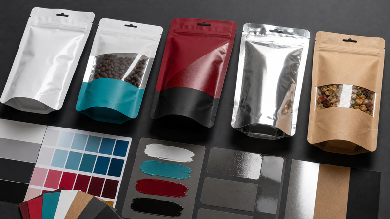
Color on a flexible pouch is created by more than the visible CMYK artwork. White ink can control opacity, spot colors can reproduce important brand hues, and varnishes can change gloss, texture, scuff resistance, or the way selected graphics catch the light. These elements are especially important when printing on transparent film, metallic film, or kraft paper because the substrate becomes part of the final color.
Designers should decide how these effects will work before final artwork is built. Adding a white plate or spot varnish at the end can change separations, trapping, ink coverage, cost, and lead time. It can also expose conflicts with seals, windows, barcodes, and manufacturing tolerances. Discuss the material, printing method, color target, and special effects early in the supplier’s how to customize packaging workflow.
Why the Substrate Changes Printed Color
Printing inks used on flexible packaging are generally translucent. Light passes through the ink, reflects from the material or layers behind it, and returns to the viewer. On white film, the white surface provides a relatively neutral reflective base. On clear film, the product and background show through. On metallic film, reflected light creates brightness and a metal-like character. On brown kraft paper, the warm, darker fibers influence every transparent color placed above them.
This is why the same CMYK values cannot be expected to look identical across structures. A bright yellow on white film may appear muted on natural kraft. A blue over metallic film may become darker and more reflective. A photograph printed without a white backing on a clear pouch may change whenever the product color changes. Accurate planning starts by treating material color and opacity as design variables, not invisible production details.
What White Ink Does
White ink creates an opaque or semi-opaque foundation under other inks. On clear film, it can make a logo and text readable while selected areas remain transparent. On metallic film, it blocks shine where conventional color is wanted and can be omitted where a metallic effect should show through. On kraft, a white base can reduce the influence of the brown surface, although it may not create the same brightness as a factory-made white substrate.
For transparent coffee bags, the white plate often defines the visual difference between a clear product window and the printed brand panel. The artwork should clearly indicate where white is present, absent, or intentionally screened. A missing knockout can eliminate the window; a missing white backing can make small copy difficult to read against dark roasted beans.
White ink is normally supplied as a named spot color on its own layer. Converters may require a precise name such as “White,” “Opaque White,” or a system-specific term. The objects are often displayed in a temporary contrasting color on screen so designers can see them, but the separation prints white. Confirm whether the white plate should overprint, whether it needs a choke beneath colored artwork, and what tonal values are supported.
When Spot Colors Are Worth Using
Process printing builds colors from cyan, magenta, yellow, and black dots. It is efficient for photography and broad palettes, but it cannot reproduce every brand color. Spot colors use a separately mixed ink to target a hue more directly. They can improve consistency for corporate colors, saturated oranges or greens, large solid areas, and designs where a clean single-color plate is preferable to a multi-color build.
A spot ink does not guarantee an exact visual match under all conditions. The substrate, white backing, ink film thickness, varnish, lamination, lighting, and neighboring colors still influence perception. Pantone references printed on coated paper are useful communication tools, but flexible film is not coated paper. Agree on whether the target is a book reference, a measured L*a*b* value, or a signed production sample, and define an acceptable tolerance.
Each conventional spot color usually adds a printing station, plate or cylinder, ink preparation, wash-up, and setup time. A design with CMYK, white, two brand colors, and varnish may require eight stations. Before approving the palette, check the press capacity and whether every color contributes enough value to justify the complexity. Some colors can be converted to process builds; others deserve a dedicated ink because they carry the brand identity.
Spot-color naming must be exact and consistent throughout every linked file. Duplicate swatches can separate unexpectedly. Remove unused swatches and inspect the final PDF separations. The primer on RGB vs CMYK for flexible packaging explains why screen colors need deliberate conversion rather than an automatic export at the end.
Varnishes and Their Visual Roles
A varnish is a clear coating applied over or within the printed construction. A flood varnish covers a broad area and may protect ink or create a uniform finish. A registered spot varnish highlights selected elements, such as a gloss logo on a matte background. Matte, gloss, satin, soft-touch, tactile, and high-friction finishes can each affect appearance and handling.
Varnish can also affect function. A coating in the seal area may reduce seal strength if the structure is not designed for it. A very slippery finish can influence pouch handling, stacking, or filling-machine traction; a high-friction finish may create feeding problems or scuff during distribution. Coding, labeling, and adhesive application need compatible surfaces. Keep these downstream processes in the finish specification.
Designing for Clear, Metallic, and Kraft Materials
On clear film, decide which regions should be opaque, translucent, or completely transparent. Place white beneath small type and barcodes when consistent contrast is required. Remember that the real product becomes the background in window areas. Test the lightest and darkest expected product appearance, not only an empty pouch.
Natural kraft creates an intentionally organic, warm appearance, but color is less predictable because paper shade and fiber texture vary. On colored kraft paper bags, the paper color, coating, and white layer can interact in additional ways. White ink may improve contrast, yet dense white can look different from a white paper laminate. If clean pastel colors or photographic skin tones are central to the brand, white kraft or a film-based imitation may offer more control.
Building the Artwork Separations
Create separate, clearly named layers or spot-color swatches for opaque white, each special ink, and every registered varnish. Use vector shapes where possible. Do not communicate a finish only with layer opacity or a visual mock-up; the production separation must contain a measurable object. Include a legend outside the print area explaining what each technical color represents.
Review knockout and overprint carefully. White commonly prints beneath colors, but its interaction depends on print order and converter settings. Varnish may need to knock out of clear windows, seal zones, date-code panels, or areas intended for labels. Spot inks may overprint or knock out depending on the desired result. Use separation preview and overprint preview, then ask prepress to confirm the production logic.
Allow for choke and spread where white meets transparent or metallic areas. Without a slight inset, white can peek beyond colored artwork as a visible halo if registration moves. Too much inset can create an unintended dark or metallic edge. The correct trap depends on press capability, material, and graphic size, so use the converter’s value.
Proofing and Approval
A monitor proof can verify layout and separation names but cannot accurately reproduce opacity, metallic reflection, kraft absorption, gloss, or texture. A contract color proof may predict process color on a defined base, while a digital print on a similar material can help with scale and overall impression. Only a production-representative sample using the intended inks, coatings, structure, and print method can demonstrate the combined physical effect.
Evaluate samples under consistent lighting and in the filled state. Bend the pouch, open the gusset, and inspect high-contact areas for cracking or scuffing. Check barcodes, small reversed type, clear windows, and the boundary between varnish finishes. Record the approved reference and retain it under controlled storage so future production has a meaningful comparison.
Production Checklist
- Identify the exact substrate color, transparency, and metallic or paper character.
- Decide which areas require opaque white, screened white, or no white.
- Define each spot color by a unique name and an agreed physical reference.
- Confirm the available print stations and the cost impact of added inks and finishes.
- Supply white ink and registered varnishes as separate vector production layers.
- Apply converter-approved traps between backed, unbacked, coated, and uncoated areas.
- Keep coatings compatible with seals, coding, labels, machine handling, and filling.
- Inspect final separations, overprints, knockouts, and unused swatches before release.
- Approve a production-representative sample when substrate-dependent appearance is critical.
White ink, spot colors, and varnishes are powerful because they let designers control how light interacts with the pouch. They are also manufacturing operations with tolerances, costs, and functional consequences. When the substrate is chosen early, separations are built clearly, and approval is based on a physical reference, special effects can strengthen the design without creating avoidable production risk.